
TheTimeo / Watches
Toric:
Gold, with
a living surface.
A hand-hammered peony dial gives Parmigiani Fleurier’s anniversary perpetual calendar its first impression. Turn it over and another language of gold appears.
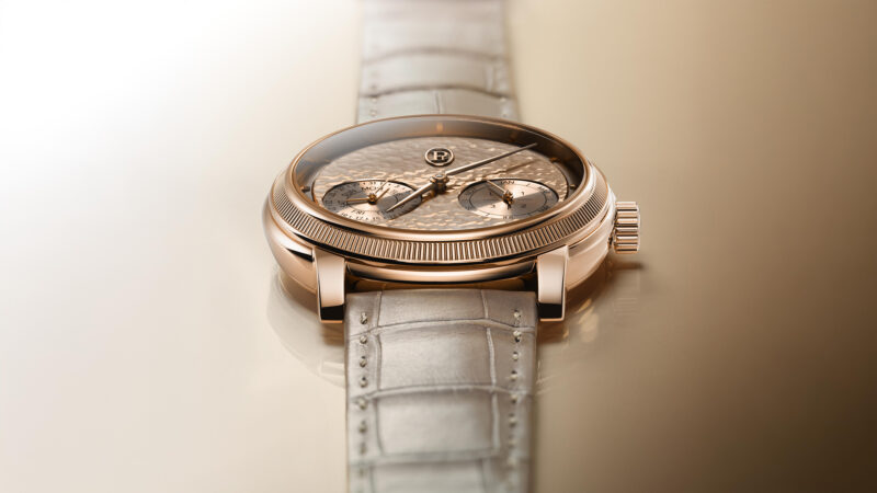
The 2026 Toric Quantième Perpétuel Anniversary, seen low across its dial and bezel. Courtesy of Parmigiani Fleurier.
Explore the story
The colour arrives before the calendar. Across a pink-gold field, small irregular marks catch the light between the hands and the indications below them. Parmigiani Fleurier’s 2026 Toric Quantième Perpétuel Anniversary gives a complicated watch an unusually immediate invitation: look at the surface, then follow what lies within it.
A surface, then a structure
01 / 03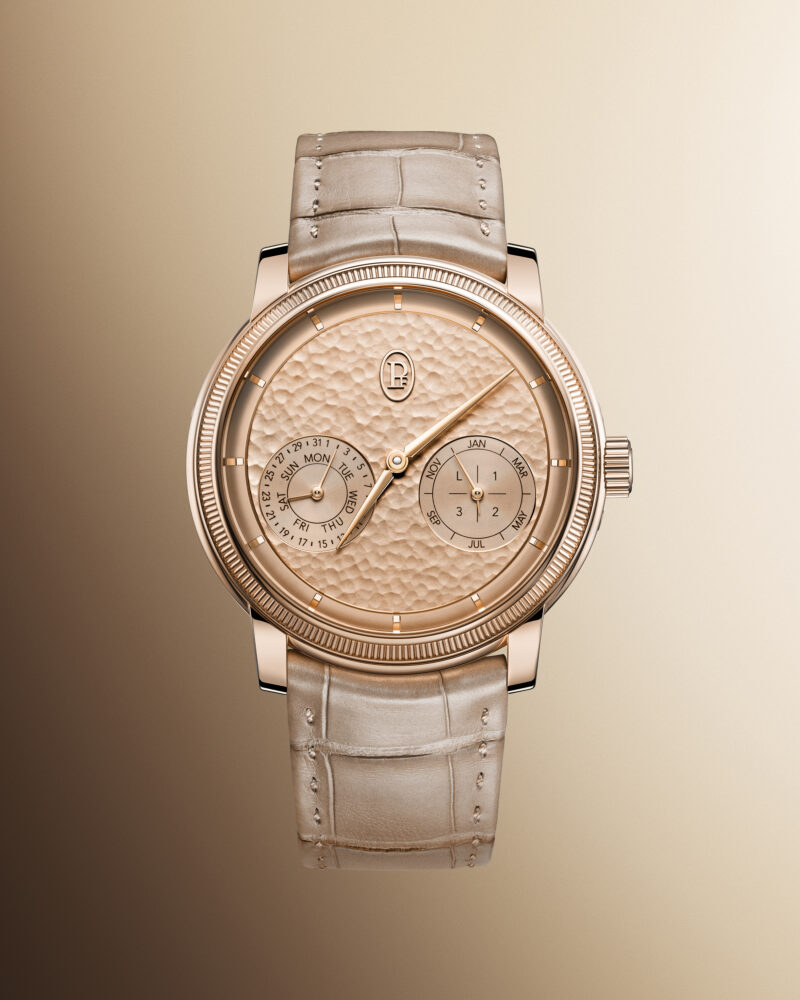
The complete front, with the two calendar displays set into the hammered dial. Courtesy of Parmigiani Fleurier.
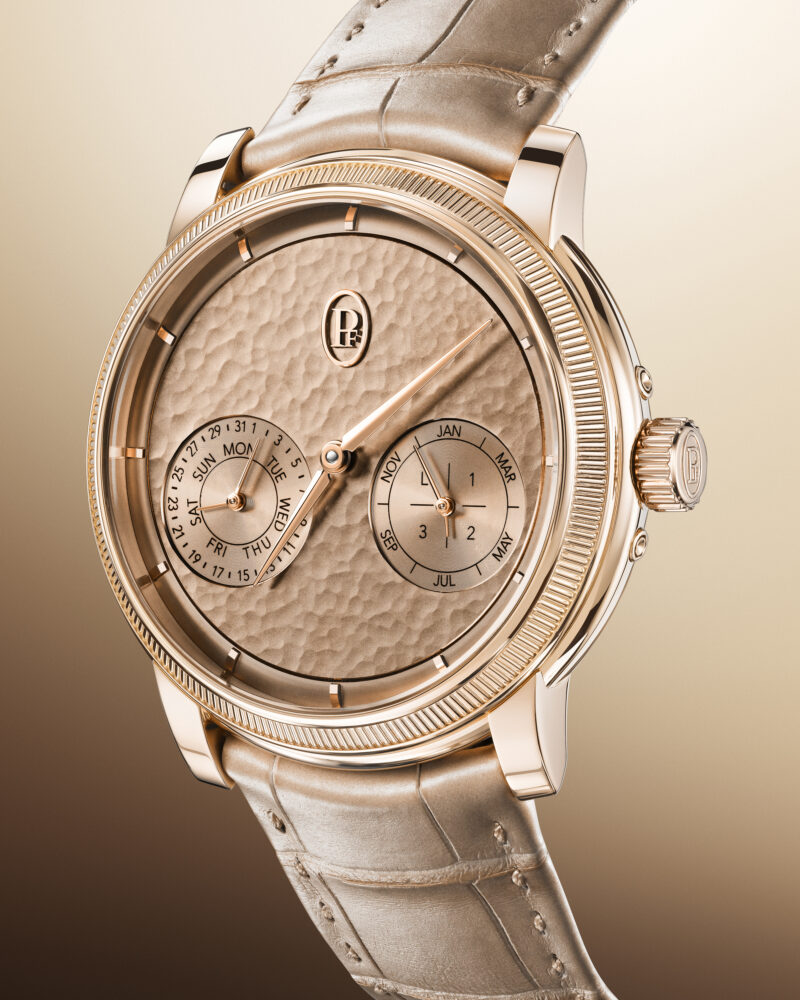
Bright Peony, close enough for the hammer marks to become part of the composition. Courtesy of Parmigiani Fleurier.
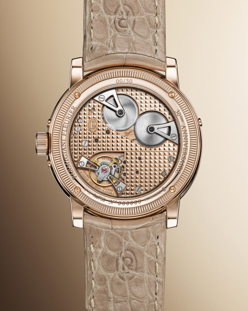
The reverse and Calibre PF733-AN, in the house’s complete portrait. Courtesy of Parmigiani Fleurier.
In the complete frontal photograph, the dial has room to breathe. The hours occupy its outer edge, while the calendar gathers into two smaller circles beneath the central hands. Those circles share the colour of their surroundings. Their borders organise the information without turning the face into a collection of sharply separated instruments.
The effect changes in the oblique view. Hammer marks that appeared as a fine shimmer become an uneven topography of bright edges and deeper colour. A smooth hand crosses that textured ground. The applied markers have a firmer outline than the marks beneath them, so the dial presents several different scales of detail at once: the broad colour, the small depressions, the sharply drawn indications.
Parmigiani calls this colour Bright Peony. The name belongs to an 18-carat rose-gold dial finished by hand with a hammer. It is a particularly expressive choice for a perpetual calendar, whose attraction often begins with the order of its information. Here, the calendar’s regular divisions sit within a surface that resists perfect repetition. The complication becomes part of a larger visual composition.
The manufacturer describes the calendar displays as coaxial: more than one indication shares an axis within each subdial. That concentration leaves a substantial expanse of textured gold visible above and around them. In the photographs, the empty intervals matter as much as the printed details. They allow the material to remain present rather than becoming a background almost completely covered by information.
This is reference PFH952-2010004-300181, a 2026 anniversary edition of 30 numbered watches. Its small series belongs to the object’s identity; the visual argument lies elsewhere. Even without knowing the number made, the relationship between the hammered field and the compact calendar would remain the most compelling reason to pause.
The mark left by the hand
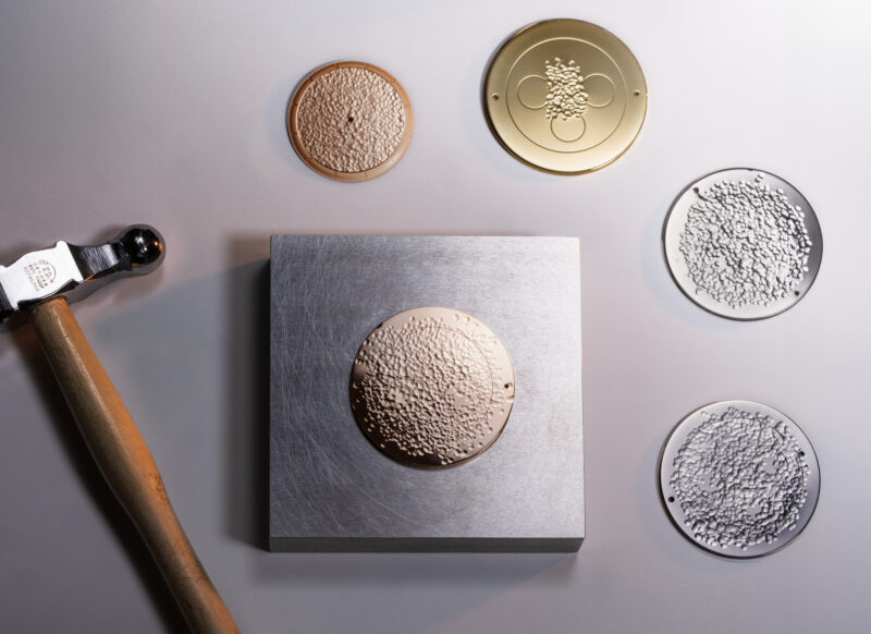
Dial studies from the Toric Anniversary craft series: collection context, rather than a documented stage of this individual watch. Courtesy of Parmigiani Fleurier.
The workshop table offers another way into that surface. Textured discs sit among tools, each catching light differently. Some marks read as fine grain; others form larger, more visible impressions. Beside the finished watch, the studies make the choice of texture feel specific. A dial can carry a similar colour and still behave very differently when the character of its surface changes.
These photographs come from the house’s shared Toric Anniversary craft series. They place the watch within a collection concerned with hand-worked gold, without documenting the manufacture of this particular numbered example. The distinction leaves the images useful on their own terms: studies of material and tools, rather than a sequence that claims to show one watch passing through every stage.
On the finished dial, the most interesting passages are the transitions. Light spreads over several small marks and then breaks at an edge. A warmer patch appears beside a paler one. Because the indications remain smooth and precisely outlined, they provide a reference against which that variation becomes visible. The surface gains movement from the relationship between the photograph’s lighting and the work already present in the metal.
There is a pleasing intimacy to this kind of detail. From a distance, a watch can register as a pink-gold circle on a pale strap. Closer inspection opens another scale of experience, one that occupies no additional space on the wrist. The dial rewards attention without requiring an added aperture, inscription or decorative figure. Its interest is distributed across the material itself.
The edge has its own rhythm
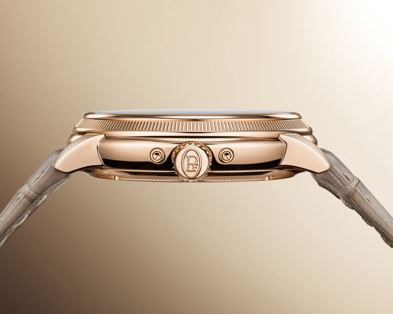
The crown-side profile: the calendar’s controls sit within a slim, layered outline. Courtesy of Parmigiani Fleurier.
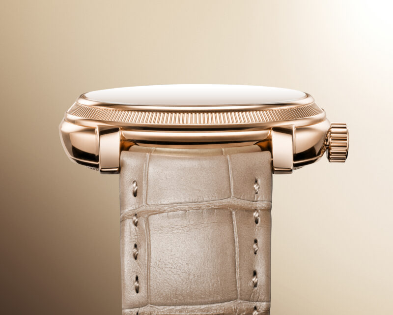
A second profile brings the lug, bezel and stitched strap into the same view. Courtesy of Parmigiani Fleurier.
At the perimeter, the Toric’s knurled bezel introduces a more regular pattern. Its repeated ridges form a narrow border around the less predictable dial. In profile, that border becomes a distinct layer above the rounded case, with a second textured edge visible around the caseback. The watch has several horizontal lines, but they remain close enough to read as one continuous shape.
The rose-gold case measures 40.6mm across and 10.9mm thick according to the official model record. The profile photographs give those measurements context. The bezel rises above the middle case; the lugs curve towards the strap; the crown interrupts the side with a compact circular form. Small correctors sit within that outline, accommodating the calendar without dominating the view from the front.
The leather supplies a different texture again. Its stitching runs in a clear line beside the edge, while the gold around it shifts between polished contours and fine knurling. In the paired profiles, the meeting of strap and lug is particularly important: it connects a structured metal object to a softer band that can follow the wrist.
Colour keeps these different elements close. The dial, case and pale leather occupy a warm range, so the eye moves between surfaces rather than jumping between strong contrasts. The result has presence without depending on a dark dial or a wide, bright bezel. A cuff beside it would become another surface in the composition, with the amount of watch revealed changing the balance.
Another way to work the gold
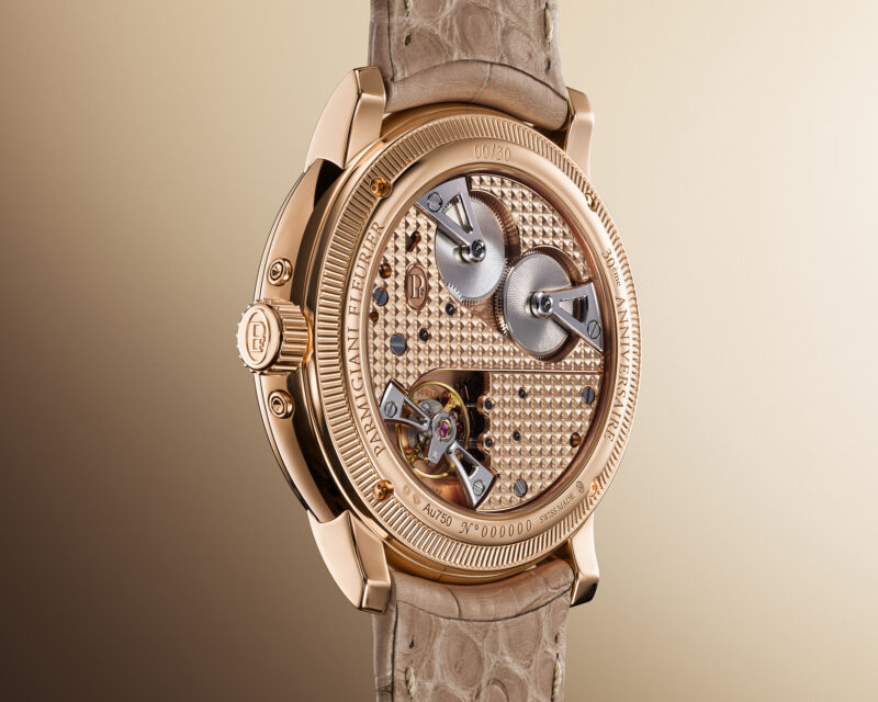
Clous de Paris and Filet sauté on the rose-gold bridges, seen through the reverse. Courtesy of Parmigiani Fleurier.
The reverse replaces the dial’s irregular marks with carefully ordered decoration. Through sapphire, broad rose-gold bridges carry dense patterns that alter direction across the movement. The close photograph brings those fields beside polished edges, screws and the visible mechanism. It is a different treatment of the same warm material, with structure expressed through repetition and boundaries.
Parmigiani identifies the movement as the hand-wound PF733-AN, with a stated reserve of 60 hours. Its solid rose-gold bridges receive double hand-guilloché decoration using Clous de Paris and Filet sauté. The useful comparison is visible before the terminology is learned: a field of small geometric marks gives way to bands and edges, each part defining a different area of the movement.
The absence of a winding rotor leaves the bridge arrangement open to view. That openness makes the reverse a satisfying counterpart to the front. The dial concentrates its information into small circles; the movement distributes its decoration across larger shapes. Both sides make complexity readable through the areas they leave clear and the boundaries they choose to emphasise.
Turn the sequence back to the opening photograph and the watch feels more complete. The peony colour is still its first attraction, but the border, profiles and decorated reverse now give that colour a structure. The anniversary Toric offers several ways to work gold within one small object. Its strongest quality is the continuity between them: a surface that invites a closer look, and a watch that continues to reward it when the view changes.
Sources & further reading
The Edit
Watches stories
Selected stories from the same editorial universe.

Rolex Perpetual Padellone: How an Annual Calendar Makes Three Displays Jump at Midnight
At midnight, Rolex’s new annual calendar has to identify a short month, skip a
Reverso Tribute Geographic: A World Behind the Dial
A blue dial keeps the first impression quiet. Turn the Reverso Tribute Geographic and
Reverso Pegasus: A World Carved Around the Movement
Carved gold, blue lacquer and an open movement give the Reverso Pegasus three ways

Grand Seiko SLGB015: Lake Suwa in a Smaller Frame
A blue surface catches the light inside a 37mm steel case. Grand Seiko’s SLGB015
A Horse in Crystal: Hermès Arceau Samarcande
On the Arceau Samarcande W408546WW00, Hermès cuts a horse into a Saint-Louis crystal dial
Blancpain Lady B: What Does 19 Millimetres Require?
Blancpain’s 19 mm Lady B is best understood as an exercise in mechanical volume: