
TheTimeo / Luxury Living
THE TANK:
a rectangle in conversation with dress
A close reading of the Cartier Tank through proportion, brancards, strap, bracelet and the changing frame created by the wrist and the sleeve.
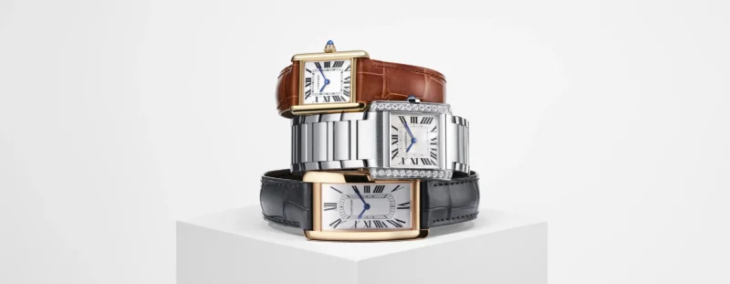
The Tank family makes proportion, material and bracelet architecture visible in one frame. Courtesy of Cartier.
Explore the story
Place a rectangle at the wrist and the surrounding lines become newly visible. A shirt cuff turns into a border; a curved bracelet becomes a counterpoint; the narrow gap of skin between sleeve and strap becomes part of the picture. The Cartier Tank is useful to study not because it supplies a formula for elegance, but because its construction makes the conversation between watch, wrist and dress unusually clear.
The object, in five lines
- Cartier dates the Tank design to 1917 and identifies two parallel brancards as its signature.
- A 1920 Tank in the Cartier Collection documents an early surviving example.
- Later Tank forms changed length, curve, scale and bracelet integration.
- The watch’s visual effect depends on the entire line from case to strap or bracelet.
- Clear geometry invites contrast as readily as coordination.
Read the whole line
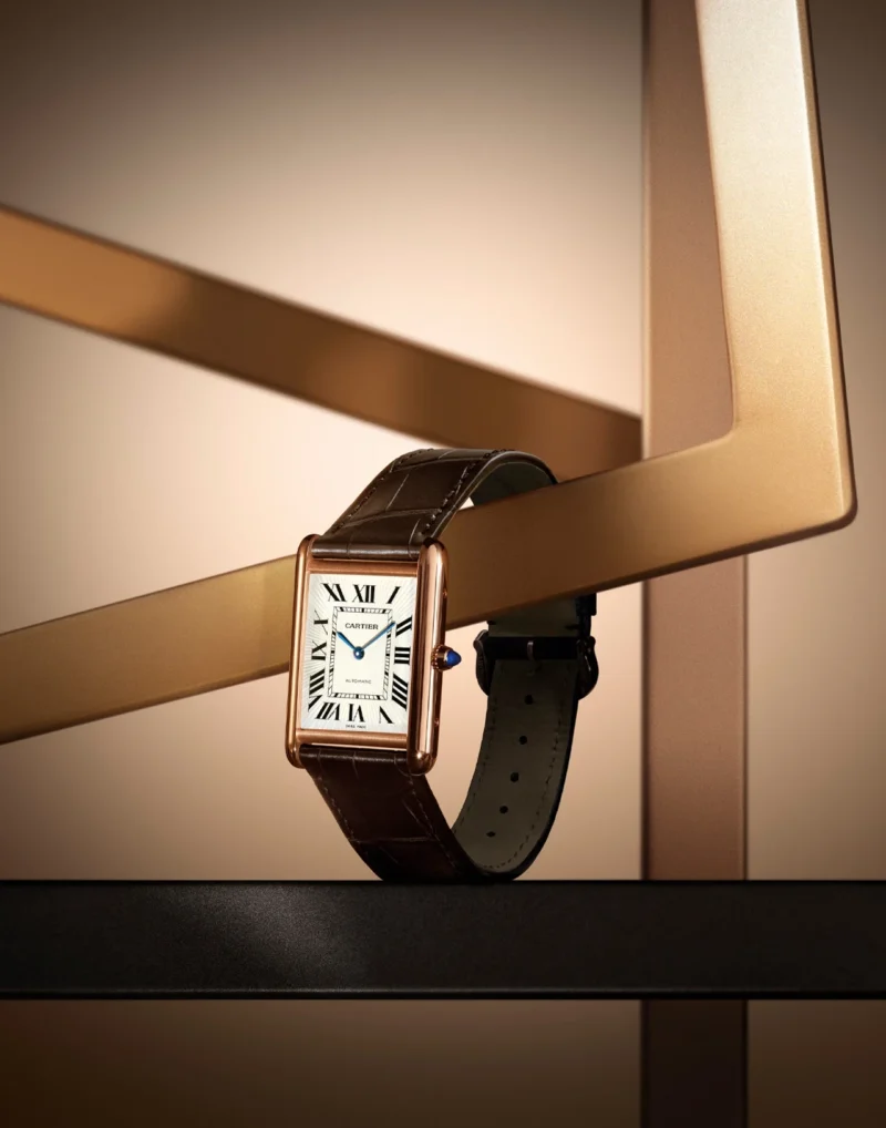
Tank Louis Cartier watch illustrating the collection’s enduring rectangular design. Courtesy of Cartier.
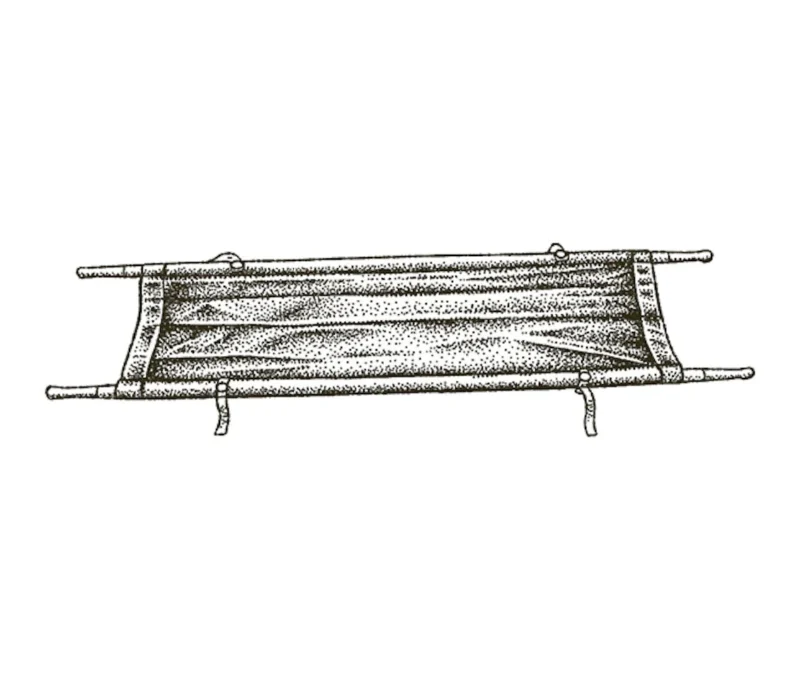
Cartier illustration explaining the Tank’s brancards. Courtesy of Cartier.
The first mistake when looking at a shaped watch is to isolate the dial. On the wrist, the eye does not stop at the crystal. It follows the case edges, lugs, strap and the space where those elements meet the body. Cartier describes the Tank through two parallel side bars that extend the case into the strap. Whatever one thinks of the maison’s language, this is a visible and testable design fact: the watch is organised around continuity.
Cartier’s archive records a Tank wristwatch made in Paris in 1920, using platinum, gold, sapphire and a leather strap. It calls the piece one of the earliest Tank wristwatches in the Collection. Cartier dates the original design to 1917 and connects the case’s plan to the view of a military tank from above. The historical metaphor is familiar; the more useful design observation is how the two long rails contain the dial and direct the gaze beyond it.
That directional quality distinguishes the Tank from a round case whose outline closes on itself. It does not make one geometry superior. It simply gives the rectangle a particular energy: across the dial, then outward along the wrist.
A shape that changes by proportion
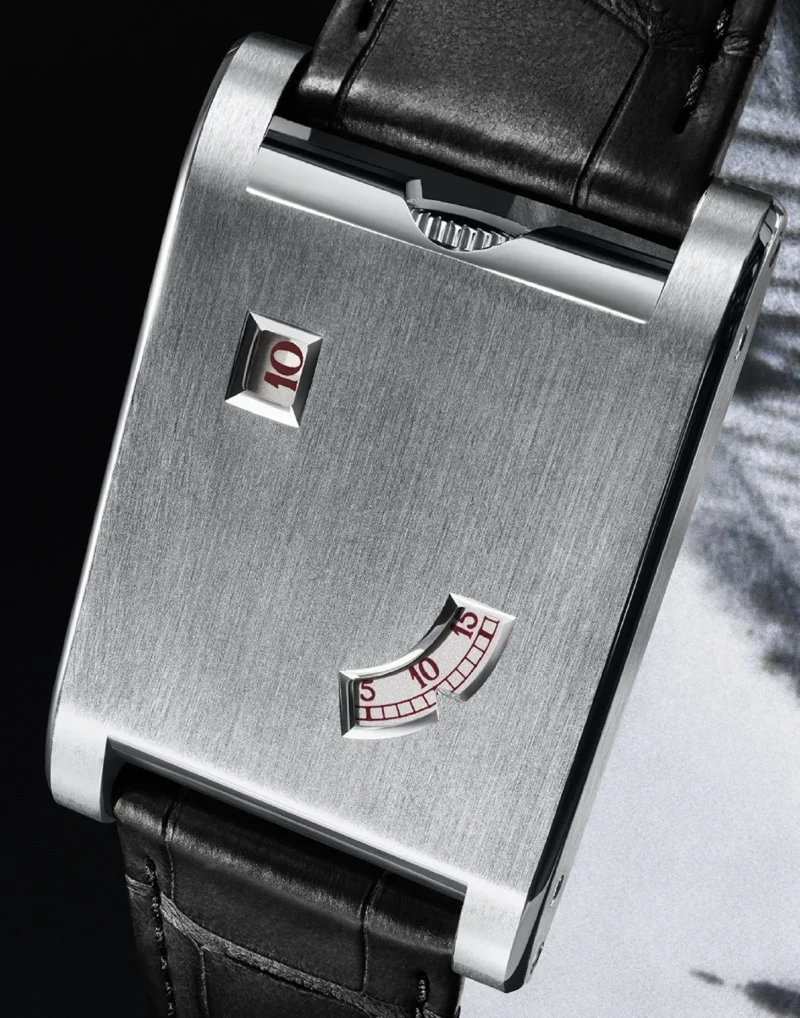
Tank à Guichets showing how Cartier reworks the Tank design language. Courtesy of Cartier.
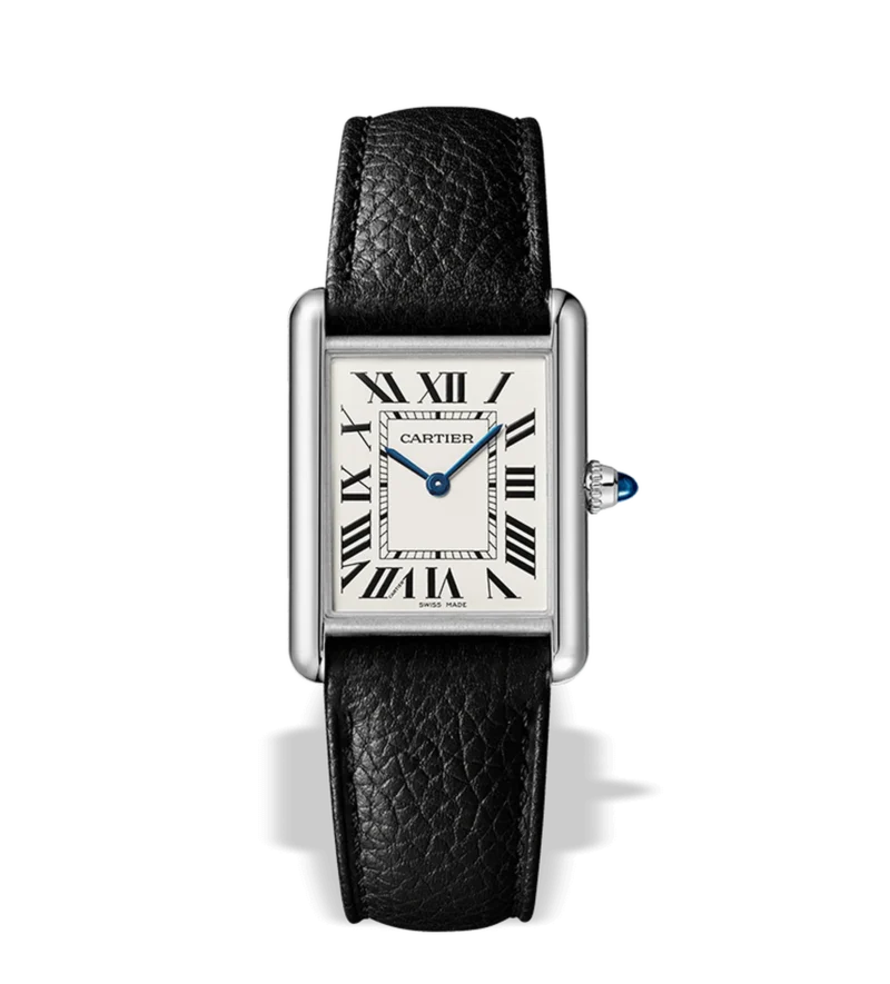
A leather strap creates a deliberate material break after the polished case. Courtesy of Cartier.
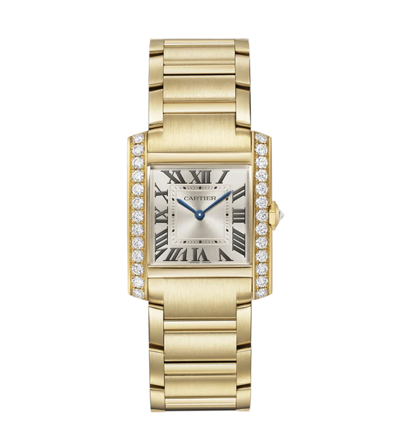
Tank Française extends the case geometry through a metal bracelet. Courtesy of Cartier.
A design family is easier to understand when differences are taken seriously. Cartier’s published chronology describes the Tank Louis Cartier as a longer, more refined development from 1921; the curved Tank Américaine launched in 1988; and the Tank Française, introduced in 1996 with a metal bracelet continuing the case. These are not identical objects wearing different names. Length, curvature and the treatment of the bracelet change how each occupies the wrist.
A longer case emphasises the direction from hand to forearm. A curved profile follows the wrist more closely in side view. A metal bracelet can turn the watch into a continuous band of repeated hard surfaces, while leather creates a strong material break after the case. Scale changes the balance again. A small rectangle may read as a punctuation mark; a larger one takes on the presence of a graphic panel.
This is why case measurements alone do not predict the worn impression. The ratio between length and width, the visible span of the strap, the colour of the dial and the contrast between case and skin all contribute. The same nominal size can appear different on two wrists or beneath two sleeves.
The cuff as a second frame
Tailoring introduces another rectangle. A square shirt cuff, a softly rolled sleeve and the open edge of a jacket each set a different boundary around the watch. When the cuff is crisp and close, Tank and cloth can form nested frames. That may feel composed, but too much alignment can also look severe. A soft or irregular sleeve loosens the relationship.
The Victoria and Albert Museum’s account of its Cartier exhibition places the maison’s watches within decorative arts, technical invention and changing image-making. The exhibition included more than 350 objects and treated watches and jewellery together. That curatorial decision is useful here: the Tank can be read as a timekeeper, an industrially suggestive shape and an element of dress at once.
Try moving the cuff before changing the watch. A centimetre of visible strap can make the rectangle feel separated from the garment. Letting the sleeve cover part of the case can make the watch quieter. Folding a soft cuff back creates more open space and gives the full outline greater emphasis. These are choices, not corrections.
Curves are not the enemy
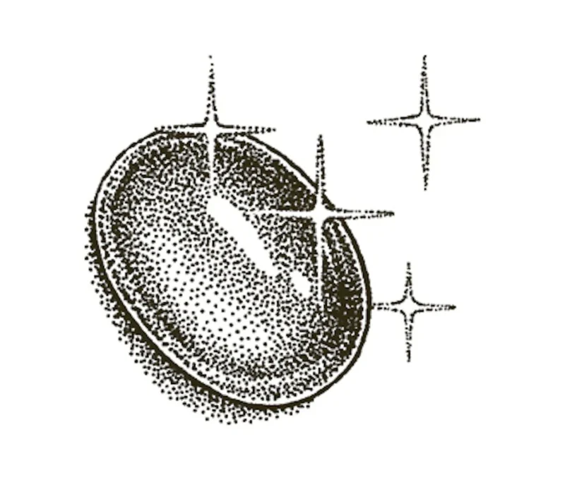
A Cartier illustration of the cabochon cut: a smooth, rounded surface rather than facets. Courtesy of Cartier.
It is tempting to pair a rectangular watch only with straight lines. Yet contrast often reveals design more clearly than repetition. A round bangle beside the Tank makes the case’s straight sides conspicuous. A curved neckline or fluid knit prevents the geometry from becoming overly literal. Conversely, another rectangle can establish rhythm if scale or material separates the two.
The winding crown, Roman numerals and minute track add smaller shapes inside the case. Depending on the model, a sapphire cabochon provides a point of saturated colour at the side. That detail need not be echoed elsewhere. It may work precisely because it is a solitary accent.
Mixing metals follows the same principle. The colour name matters less than distribution. A steel Tank beside a narrow gold bracelet can read as one broad cool field and one warm line. A two-tone bracelet distributes the contrast repeatedly. Neither is automatically more resolved; the surrounding clothes and the amount of bare skin alter the result.
Strap, bracelet and visual temperature
Leather absorbs light and introduces colour without adding reflectivity. Black can sharpen the case outline, while brown, burgundy or another hue can connect the watch to cloth rather than jewellery. A polished metal bracelet produces repeated highlights and usually gives the wrist more visual weight. Matte surfaces quieten that rhythm.
These differences are observable rather than hierarchical. They also explain why changing a strap can feel like changing more than an accessory. It alters the line leaving the case, the proportion of hard to soft material and the relationship with shoes, belt, bag or none of those things. Literal coordination is optional. A strap may instead pick up a minor colour in a pattern or provide the only dark note in a pale look.
Comfort sets a practical boundary. A case that catches the cuff or a bracelet that pushes the watch out of position will behave differently from a still photograph. Before judging the combination, bend the wrist, type, reach and put on the outer layer intended for the day. Geometry has to survive movement.
What the archive can and cannot tell us
The archive establishes dates, materials and the persistence of a design idea. It cannot decide how a present wearer should combine the object. Nor does longevity prove that every version suits every person. Historical importance and personal usefulness are separate judgements.
The Tank’s lesson is therefore not that one watch belongs with one wardrobe. It is that proportion can carry identity. Across early leather-strapped examples and later curved or bracelet-integrated forms, the two long sides remain a recognisable organising device. The wearer supplies the next frame: wrist, sleeve, gesture and occasion.
Look at that frame as carefully as the dial. The rectangle will tell you what it is doing, but it will not issue an instruction.
Sources & further reading
Historical and object details come from the Cartier Collection watchmaking archive, Cartier’s account of its watchmaking design principles and the Victoria and Albert Museum’s Cartier exhibition research. Sources were checked on 3 September 2026. Statements about cuffs, contrast and visual weight are TheTimeo’s analysis of the documented forms, not claims made by the institutions.
The Edit
Luxury Living stories
Selected stories from the same editorial universe.
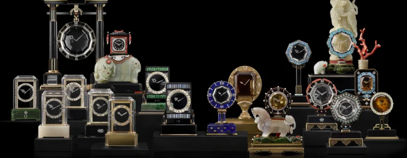
Before the Wrist: When Timekeeping Was Worn as Jewellery
From an enamelled chatelaine to Santos, Tank, Tutti Frutti and Crash: Cartier shows how
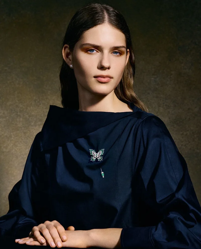
The Brooch in Motion: Placement, Gesture and Dress
A brooch changes the line of a garment through placement, scale and movement. This
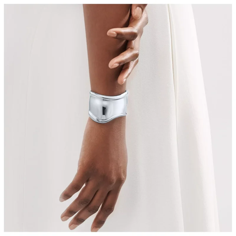
Elsa Peretti’s Bone Cuff: When Jewellery Follows the Body
Elsa Peretti’s Bone cuff begins with anatomy: a side-specific, asymmetric silver form whose surface
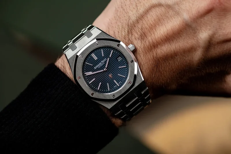
Watches in High Fashion: Blurring the Line Between Horology and Couture
Luxury watches have evolved from simple timekeeping devices into status symbols and integral fashion
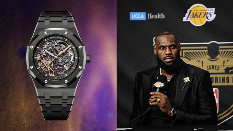
Celebrity Endorsements: How A-List Icons Are Influencing Watch Trends in 2024
Luxury watches and celebrity culture have long been intertwined, with A-list icons driving major
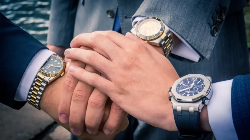
The Watch as a Fashion Icon: How to Make Your Timepiece the Focal Point of Any Outfit
Luxury watches have transformed from simple timekeeping devices into powerful fashion statements. Whether attending