
TheTimeo / Luxury Living
Louis Vuitton:
Colour
in command.
Victory’s changing colours, Conquest’s red pulse and Fortitude’s blue centre: three ways Mythica gives a high jewellery necklace its presence.
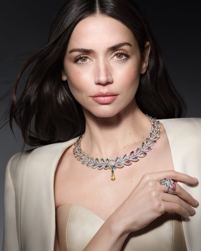
Ana de Armas wears Victory from Louis Vuitton Mythica. Courtesy of Louis Vuitton.
Explore the story
A yellow drop hangs below a necklace whose colours change as they travel around the neck. Above it, bright pointed forms open outwards; beside it, a ring introduces another small field of colour. Ana de Armas wears Victory with enough bare space around the jewel for its outline to remain unmistakable.
Louis Vuitton Mythica offers eleven themes and 110 creations. Three necklaces provide a particularly revealing way into its design language. Victory lets colour move around a curve. Conquest gives red a repeated rhythm. Fortitude gathers attention at one blue centre. Their differences become clearest when you look from the complete object to the person wearing it.
A spectrum, then a pulse of red
01 / 02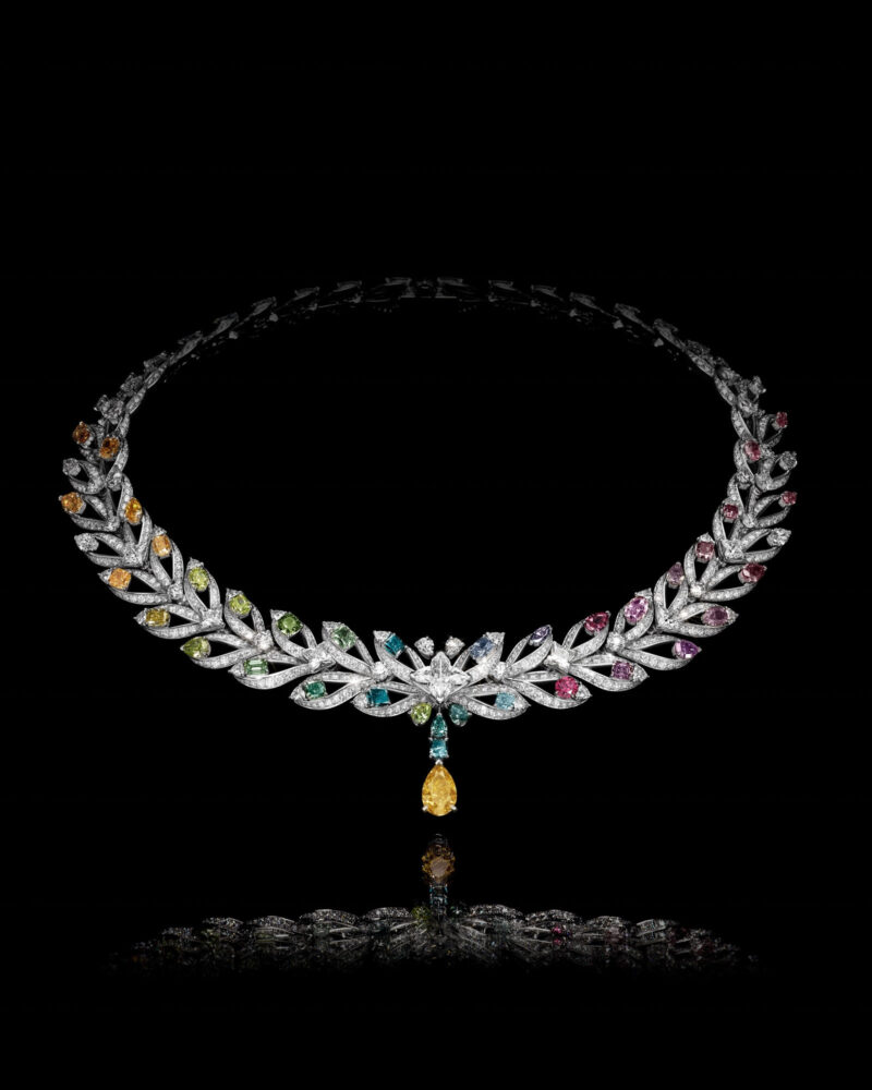
Victory: a changing palette follows the curve towards a yellow drop. Courtesy of Louis Vuitton.
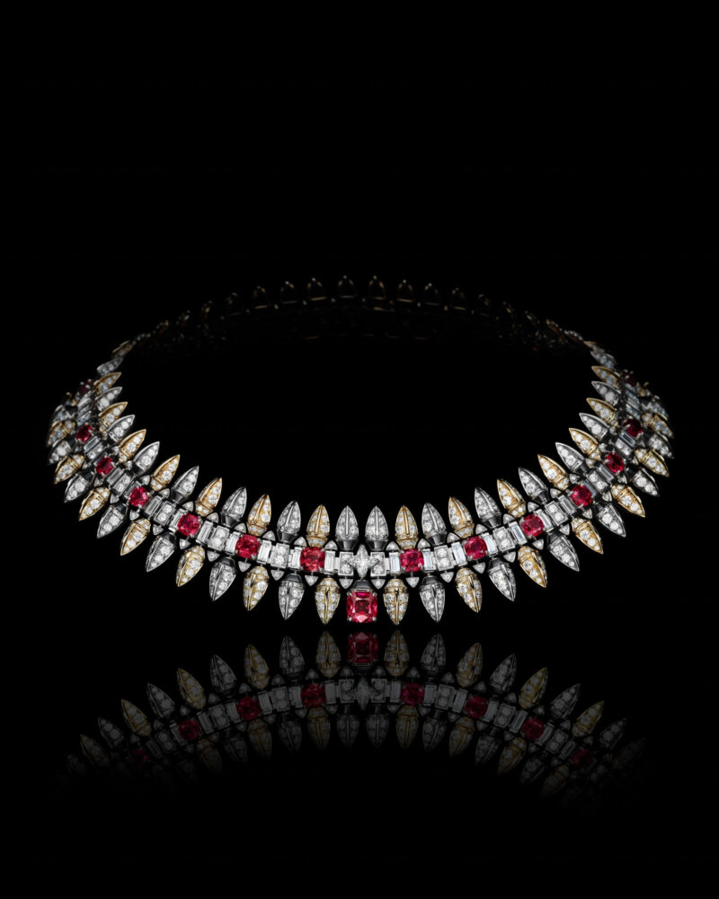
Conquest: red accents establish a repeated rhythm across the front. Courtesy of Louis Vuitton.
On a dark background, Victory describes an open oval. A dense bright knot gathers at the front, with a yellow drop directly beneath. Along either side, smaller coloured points change hue as the necklace turns away. The outline is decorative, yet the path through it is easy to follow: around the curve, towards the centre, then down.
Conquest establishes a different pace. Red stones repeat across the front, separated by pale, pointed elements. A darker border gives the red areas a clear edge. The necklace looks more insistently directional, with the bright lower points extending towards the chest. Colour becomes a sequence of distinct beats.
The still lifes reward being seen together because neither relies on the proportions of a face or dress. Their different organisations remain visible on the same dark ground. With Victory, your eye can wander through a gradual change. With Conquest, it returns to the red intervals and the sharp rhythm beneath them.
That distinction is useful when considering a coloured necklace of your own. Ask where the design directs attention before looking at individual stones. A changing palette can lead the eye along a whole piece; a repeated strong colour can establish a firmer pulse. The question is which kind of movement you want close to the face.
Before the red finds its place
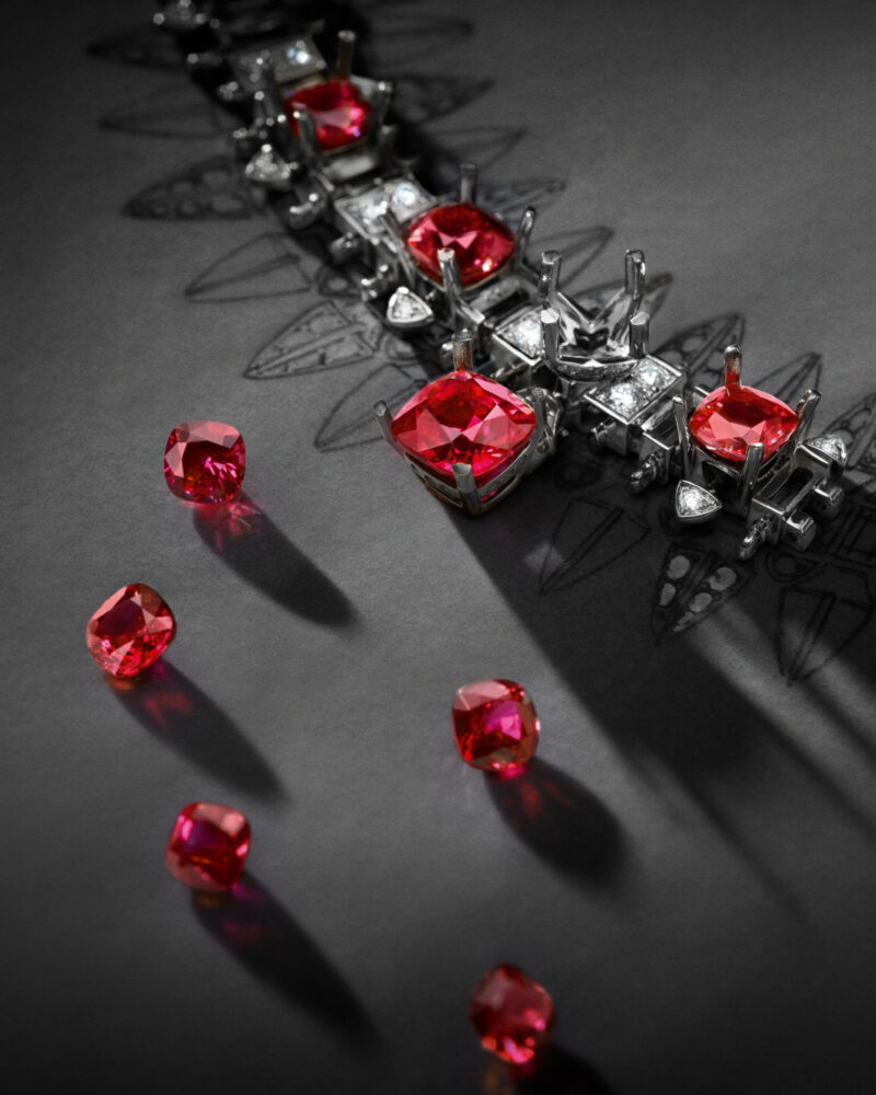
Rubies and the Conquest mounting during setting. Courtesy of Louis Vuitton.
At the workbench, several red stones lie beside a partly set structure. Each casts a small shadow across the dark surface. The open metal around the central area can be followed more easily than in the finished portrait, where bright edges and reflections combine into a continuous field.
Louis Vuitton identifies rubies, onyx, white and yellow gold, and diamonds in Conquest. Here, the image separates colour from its final setting. The loose stones appear as individual volumes; the mounted elements show the intervals into which those volumes must fit. It is a different scale of attention from the sweep of the complete necklace.
Look particularly at the distance between one red stone and the next. The completed pattern depends on those intervening shapes. A coloured gem supplies an accent, while the structure around it establishes direction and rhythm. Seen this close, the necklace begins to look like a drawing assembled in three dimensions.
The photograph leaves something worth carrying back to the finished view. Follow a single red accent out towards its surrounding points, then repeat the journey at the next one. What first appeared to be a broad band resolves into a succession of related decisions, each occupying a very particular place.
Blue changes the centre of gravity
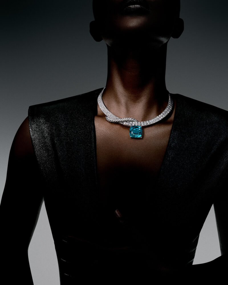
Fortitude on the body: blue becomes the principal point of attention. Courtesy of Louis Vuitton.
Fortitude is worn above a dark, angular neckline. The face remains in shadow while a large blue centre catches the light. A pale band follows the neck and descends towards it, establishing a narrow route through a much larger dark silhouette. The jewel has a strong presence with very little competing detail.
The house identifies the centre as an 82.14-carat blue zircon. Its rectangular, softly cornered outline gives the composition a different character from Victory’s yellow drop. Width becomes as important as descent. The surrounding bright band narrows the eye towards a centre that then opens out again.
This is a useful image for judging the company a strong colour needs. The clothing introduces large, quiet planes; the setting supplies a finer rhythm between them. Imagine a busier neckline in that same space and you can see how much the relationship would change. The blue works within the entire silhouette.
A necklace can therefore be considered at two distances. From across a room, its outline and principal colour establish the first impression. Close by, the route through the smaller elements becomes apparent. Fortitude makes the first distance especially persuasive, while inviting you to come nearer to understand the band.
The setting holds the colour
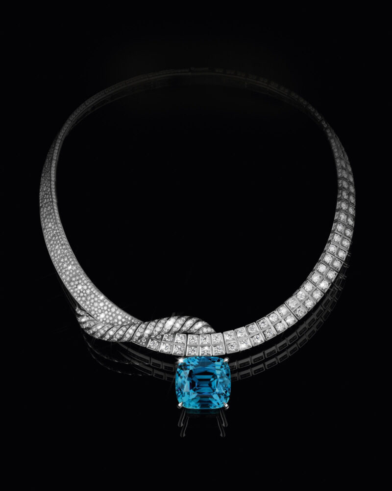
Fortitude: the house identifies the blue zircon as 82.14 carats. Courtesy of Louis Vuitton.
The still life removes the shoulders and leaves Fortitude suspended against black. The bright band seems to turn on itself before meeting the blue stone. Small rectangular areas interrupt the finer surface, giving the surrounding setting a visible structure of its own.
Without the portrait’s strong neckline, you can follow the outer contour around the whole necklace. The blue remains the point of arrival, but it is held within a drawing that carries attention all the way back towards the neck. The darker ground makes the intervals between those contours especially clear.
Return to the worn photograph after this view. The band now has more character: a shaped surface with changes in scale, direction and brightness. That is often the benefit of seeing a jewel both alone and on the body. One image clarifies its construction as a composition; the other shows how that composition participates in a look.
Choose a rhythm, then a neckline
Across the necklace
Follow the colour from one side to the other. Does it change gradually, repeat at regular intervals or gather at a single point? That route will influence how you read the whole piece. Give the smaller settings the same attention: they establish how one coloured area meets the next.
Across the silhouette
Look at the face, shoulders and fabric together. Notice where the jewel’s lowest point sits above the garment and how far it extends towards each shoulder. A small clear interval may do more for the composition than another accessory. Choose the relationship you enjoy seeing from a few steps away.
A turn reveals the whole drawing
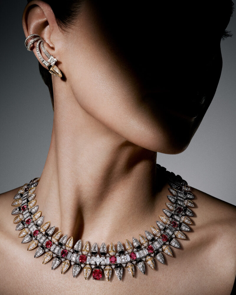
Conquest necklace and an earring, seen as the head turns. Courtesy of Louis Vuitton.
The Conquest portrait turns the face away. Red travels around the side of the neck, and a small bright ornament follows the ear. The angle gives the necklace depth: its near edge is crisp, while the far side disappears behind the body. Skin provides a warm surface between the dark background and the pointed setting.
It is an absorbing final view because the necklace remains present within an ordinary movement of the head. The coloured rhythm continues beyond the frontal image. At the ear, a smaller shape picks up part of the same vocabulary without duplicating the scale of the necklace.
Seen across these three designs, Mythica offers a way to be more precise about desire. You may be drawn to a gradual passage of colour, to red held within a sharp repeated pattern, or to the concentration of one strong blue. Each establishes a different relationship with the body. Finding the one you keep returning to is the beginning of a personal choice.
Sources & further reading
The Edit
Luxury Living stories
Selected stories from the same editorial universe.
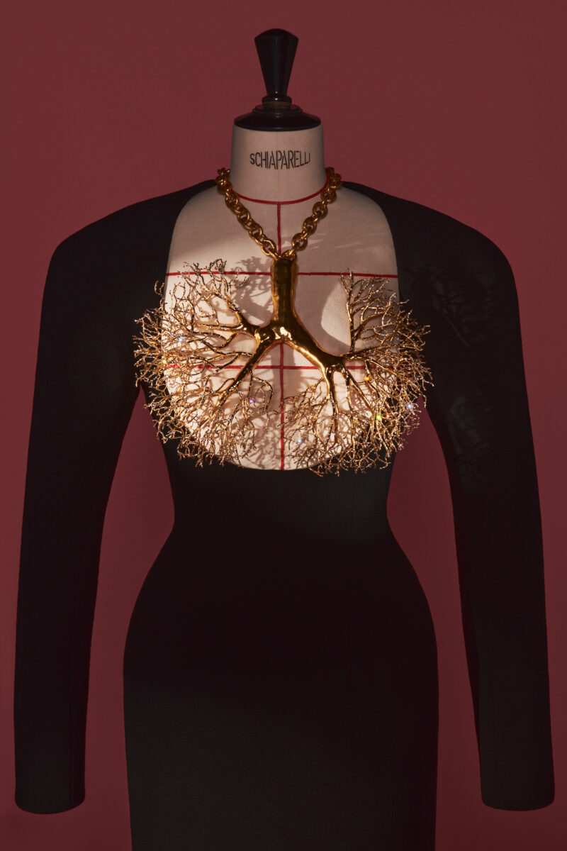
Schiaparelli: The Body as a Jewel
A necklace shaped like lungs, a ribbon hung with pine cones, an earring beside
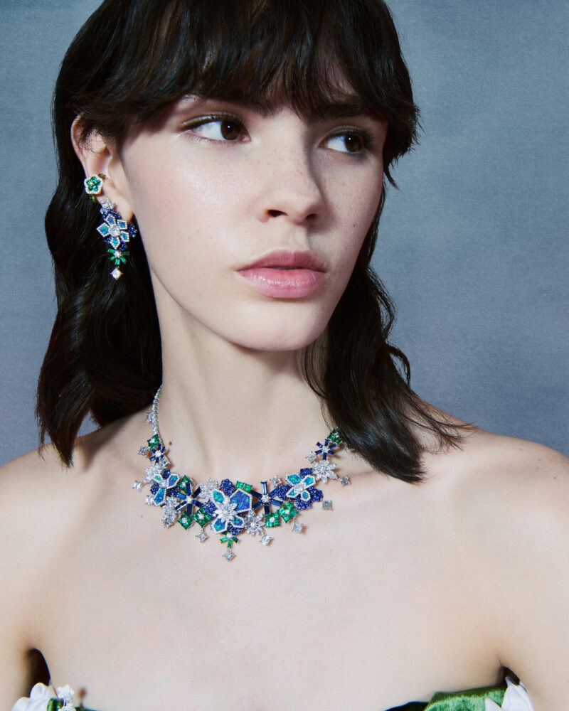
Diorissima: A Garden Composed in Gemstones
A green flower beside blue, a jewel above an open back, a brush at
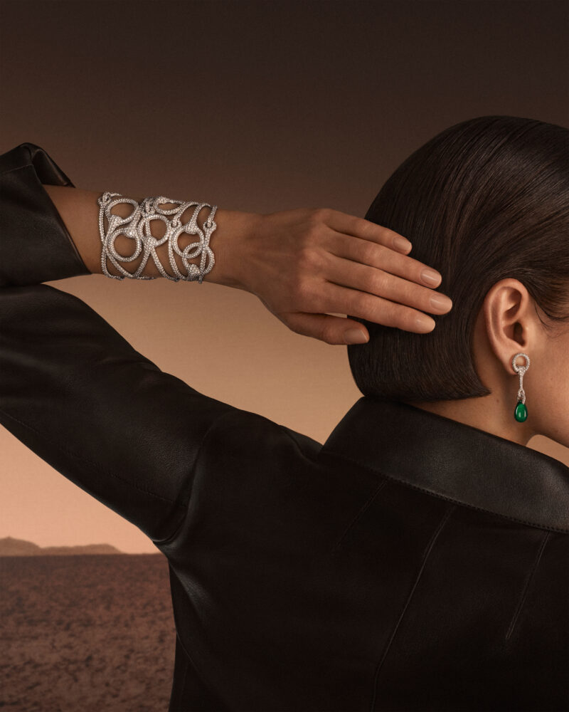
Hermès Horsescape: The Horse in the Line
A saddle at the wrist, a stirrup held against the sky, bright lines beside

CHANEL COCO CRUSH: Choosing the Mix
CHANEL’s Style Guide shows how COCO CRUSH changes when rings, bracelets, earrings and a
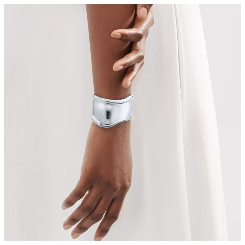
Elsa Peretti’s Bone Cuff: When Jewellery Follows the Body
Elsa Peretti’s Bone cuff begins with anatomy: a side-specific, asymmetric silver form whose surface
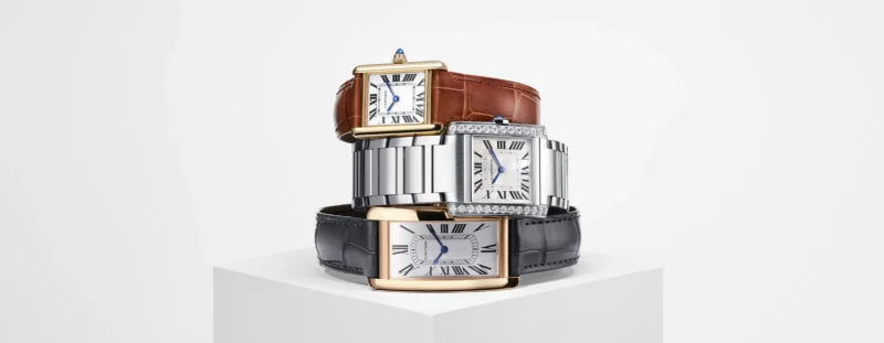
The Cartier Tank: A Rectangle in Conversation with Dress
A close reading of the Cartier Tank through proportion, brancards, strap, bracelet and the