
TheTimeo / TheTimeo Encyclopedia
Colour,
given
form.
An emerald’s steps, a ruby’s cushion and a sapphire’s smooth dome invite different ways of looking. Learn to separate the outline of a coloured stone from the way it is fashioned.
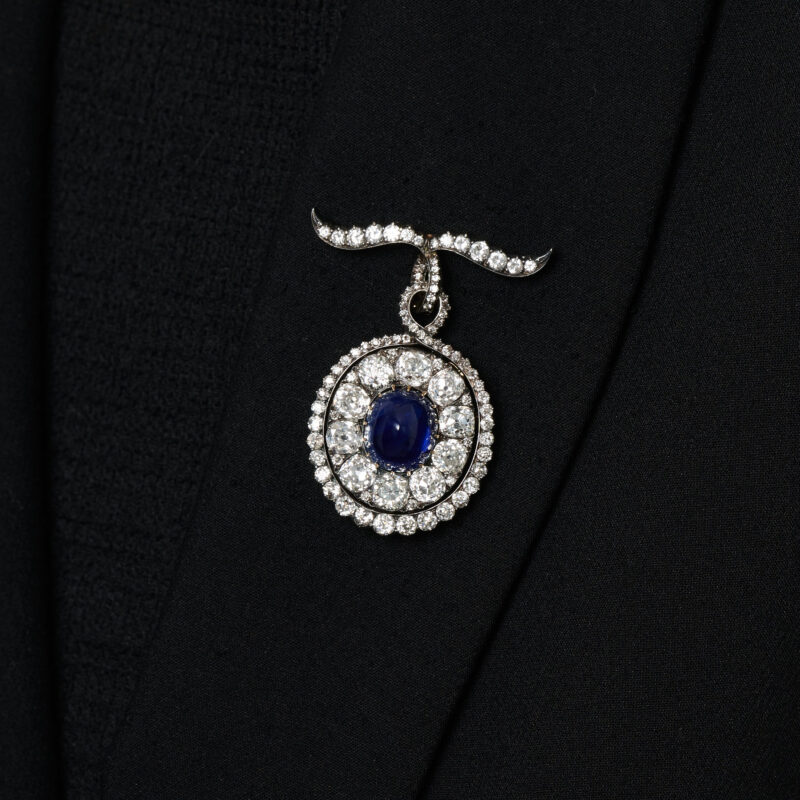
The sapphire brooch from lot 425 against dark fabric. The smooth blue centre has a different surface rhythm from the surrounding diamonds. Photograph courtesy of Phillips.
Explore the story
A blue sapphire sits inside a diamond border on dark fabric. Its surface is smooth; the diamonds around it break into smaller flashes. In a green emerald ring, a different rhythm appears: long facets follow a crisp outline. These are inviting differences to learn to see. Separating a gem’s shape from the way its surface is fashioned makes the language of coloured stones clearer, and the jewellery itself more interesting to look at.
Three surfaces, three rhythms
01 / 03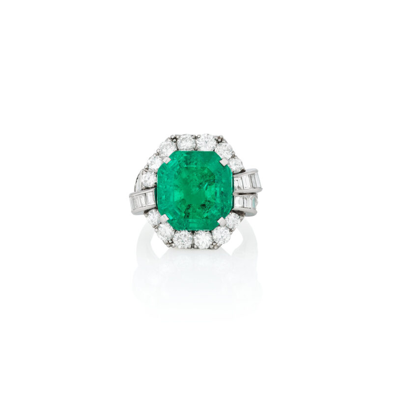
Lot 420: the catalogue identifies the 17.36 ct emerald as step-cut. Photograph courtesy of Phillips.
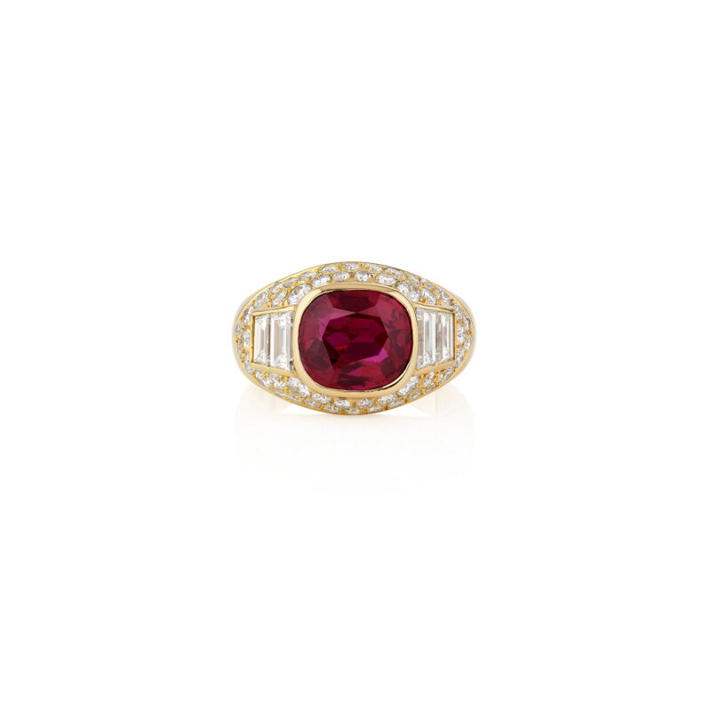
Lot 411: a 3.29 ct cushion-shaped ruby. Cushion names the outline; a cutting-style description is a separate detail. Courtesy of Phillips.
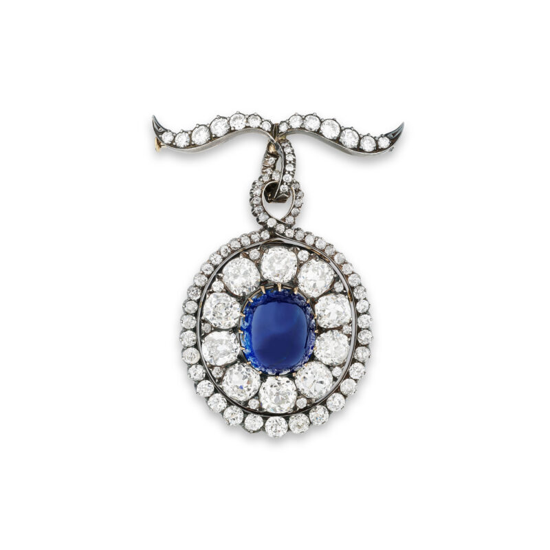
Lot 425: an 18.69 ct cabochon sapphire in a brooch with a maker’s mark for Rozet & Fischmeister. The catalogue describes the top ribbon as later-added. Courtesy of Phillips.
Begin with the emerald. Its green centre has a rectangular outline with softened corners, surrounded by diamonds that extend the composition across the finger. Phillips identifies the 17.36-carat emerald in lot 420 as step-cut. Follow the long facet edges visible around the central area, then look at how the diamond shoulders continue the shape outwards. The photograph gives the ring a strong horizontal presence even though the stone’s longer axis runs along the finger.
The ruby changes the rhythm. A rounded cushion sits within yellow metal, with small diamonds brightening the shoulders. Phillips lists its weight as 3.29 carats in lot 411. The red centre and warm surrounding metal form a compact composition. Cushion is the outline description here: it tells you about the stone’s perimeter before you know the arrangement of every facet.
The sapphire brooch offers a third surface. Phillips describes its 18.69-carat centre as a cabochon, held within a diamond surround and an upper ribbon element. The catalogue records a maker’s mark for Rozet & Fischmeister and identifies the top ribbon as later-added. Against the faceted diamonds, the curved blue surface becomes the quiet centre of a more intricate object.
These are three separate jewels, chosen to make differences in fashioning visible. Their photographs support a reading of shape, setting and surface; assessing the stones’ optical performance or the precision of their cutting requires examination beyond a catalogue view. Enjoy the sequence first, then use it to decide which questions you would like to ask when looking at a gem in person.
The outline and the surface
Shape is the line around the stone
An oval, a pear and a cushion name outlines. Trace that line before looking inward: where is the stone widest, how rounded are its corners, and where does a point lead the eye? The same outline can carry different facet arrangements. This is why a shape name alone leaves part of the description open. In a ring, the surrounding metal and adjacent stones also contribute to the silhouette you actually see.
Cutting style describes the fashioned surface
GIA distinguishes brilliant-style facets, step arrangements and mixed cuts combining the two. A cabochon has a polished curved surface instead. These descriptions answer a different question from outline. Together, they give you a more useful vocabulary for talking to a jeweller: the shape you enjoy and the kind of surface pattern that attracts you. Ask for both when a short catalogue description leaves the distinction unclear.
Bring the reading back to the hand
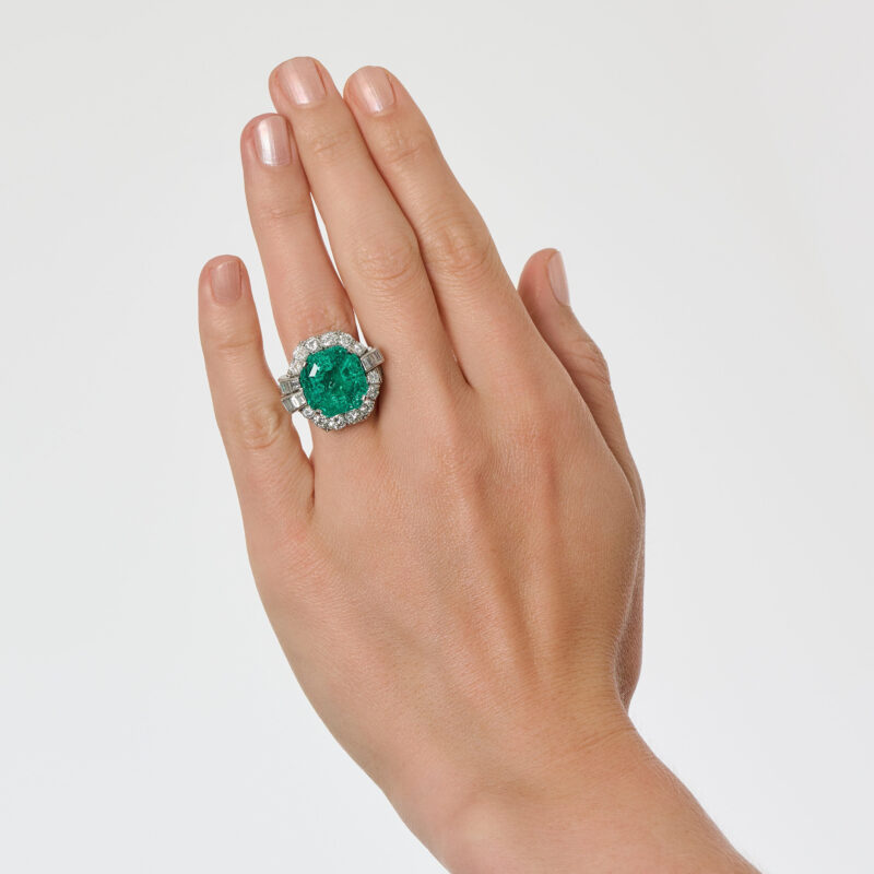
The same emerald ring on the hand: an outline seen in relation to the finger. Photograph courtesy of Phillips.
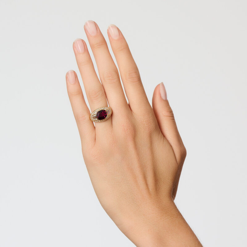
The same ruby ring on the hand. These photographs compare design and scale; they do not compare laboratory cut grades. Courtesy of Phillips.
The two worn photographs restore the rings to a familiar scale. The emerald occupies a broad area of the finger, with diamonds extending on either side. The ruby’s red centre sits within a more compact yellow-metal setting. You can compare how each design belongs to the hand without turning the comparison into a competition between gem materials or carat weights.
When you view a coloured stone, start face-up and move it gently through a small range of angles. Notice whether the centre stays engaging and how the pattern changes across the surface. Look again from the side to understand the height of the setting. Give yourself enough time to see a sequence of impressions, rather than choosing the single brightest reflection as the whole story.
Light and darkness both belong to that reading. In his GIA discussion, Al Gilbertson distinguishes several causes of dark areas, including absorption, extinction and reflections of the observer or nearby objects. Windowing is different: light passes through the gem and the area can appear see-through. A dark patch in one photograph therefore leaves its cause open. Movement and a change of viewing conditions make the observation more informative.
This is a useful habit when comparing photographs too. A pale background, black clothing and the photographer’s position can change what is reflected. Keep the individual jewel in view and resist giving a cutting diagnosis from a single frame. The more interesting question is how the whole stone appears as you spend time with it, in ordinary viewing conditions as well as a carefully lit display.
A small anatomy of the view
Finding the parts
Four words help locate what you are observing in a faceted gem. The table is the flat facet at the top, usually central. The crown is the upper portion around it. The girdle marks the outer boundary between upper and lower portions; beneath it is the pavilion.
Use them as directions when someone points out a feature. A jeweller may be referring to a facet near the girdle or to the depth of the pavilion. Knowing where to look makes that explanation easier to follow. The mount may conceal part of the stone, so ask which details can actually be seen and which need a different kind of examination.
A closer look at the finish
Craftsmanship adds another layer. GIA’s discussion of cut quality includes the outline, symmetry, polish and the way facets meet. These are useful subjects for a closer viewing, especially when a specialist can show a detail under magnification. They work alongside the colour and character of the material, rather than reducing every coloured gem to one set of ideal proportions.
There is room for individual taste within that understanding. One person may prefer the calm of a smooth blue dome; another may keep returning to the more articulated pattern of a faceted green stone. A precise description lets you express that preference more clearly. It helps a jeweller show you relevant alternatives and explain why two gems with similar outlines can create different impressions.
Look for the whole impression
Follow the perimeter, then the surface, then the jewel on the body. Those three views reveal different parts of the design. Return to the colour you first noticed and see whether the form gives it the presence you enjoy.
Learning the language of cut should make looking more absorbing. It gives you a way to describe what you like, ask a better question and recognise a stone you would want to see again.
Sources & further reading
- Phillips — lot 420, 17.36 ct step-cut emerald ring
- Phillips — lot 411, 3.29 ct cushion-shaped ruby ring
- Phillips — lot 425, Rozet & Fischmeister cabochon sapphire brooch
- GIA / Al Gilbertson — gem cutting styles and definitions
- GIA / Al Gilbertson — coloured-stone cut quality
- GIA / Al Gilbertson — darkness and brightness in coloured stones
The Edit
TheTimeo Encyclopedia stories
Selected stories from the same editorial universe.
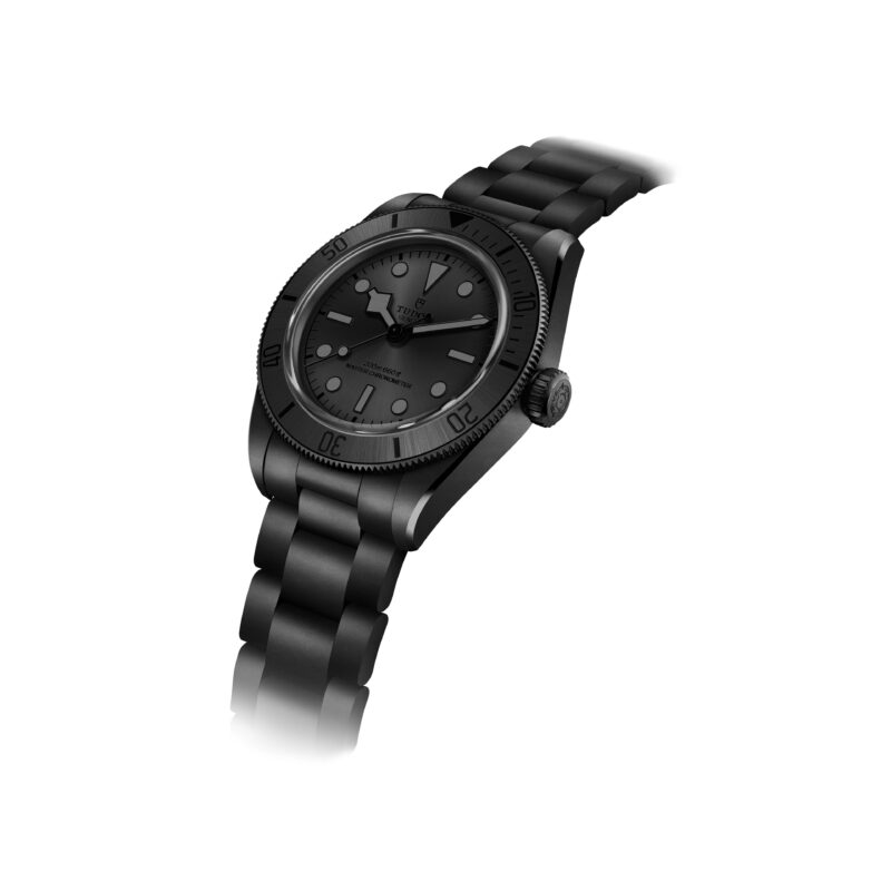
Tudor: tool-watch clarity and modern manufacture
An evergreen guide to Tudor: its 1926 origins, Oyster Prince and diving-watch history, Black
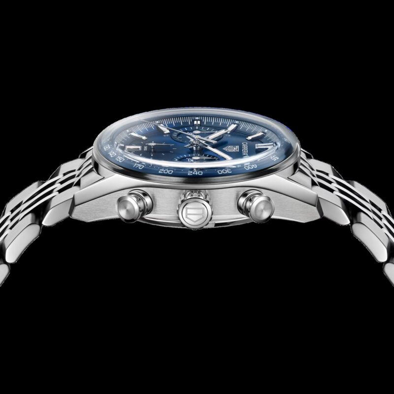
TAG Heuer: chronographs, instruments and design systems
An evergreen guide to TAG Heuer: its 1860 origins, timing instruments, Carrera and Monaco
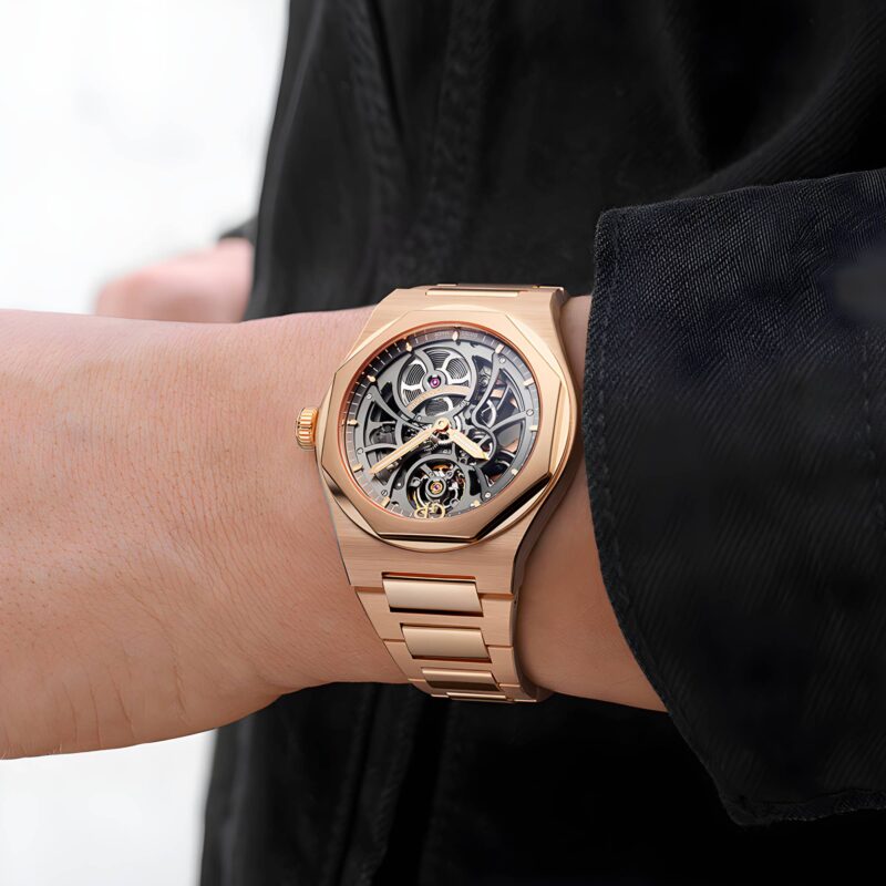
Girard-Perregaux: architecture, Three Bridges and the Laureato
An evergreen guide to Girard-Perregaux: the Bautte and Girard-Perregaux lineages, Three Bridges, movement manufacture,

Hublot: material fusion, Big Bang and Unico
An evergreen guide to Hublot: the 1980 gold-and-rubber premise, Big Bang architecture, Unico chronographs,