
TheTimeo / Maisons & Heritage
Hemmerle:
The beauty
of iron.
Dark iron, pale diamonds, wood and patinated copper. At Hemmerle, the character of a jewel begins where two materials meet.
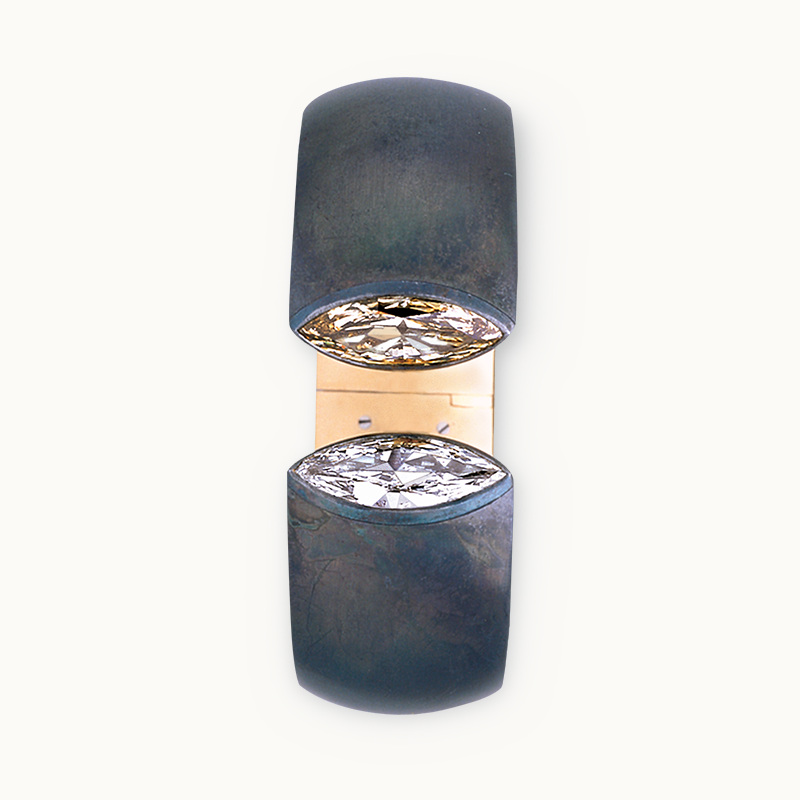
Harmony bangle, 1997: diamonds, iron and yellow gold. Private collection. Courtesy of Hemmerle.
Explore the story
Two diamonds face one another across a narrow opening. Around them, the iron curves into broad, dark shoulders. A fine line of yellow gold appears inside. The Harmony bangle pictured here dates from 1997, yet its most arresting quality feels immediate: the stones seem brighter because the metal around them asks for so little attention.
This is a way into Hemmerle’s identity. The Munich jeweller treats iron, copper and wood as expressive materials in their own right. Follow the same bangle through several combinations and you begin to see how surface, colour and contrast can make a house recognisable without a repeated decorative emblem.
One curve, four different characters
01 / 04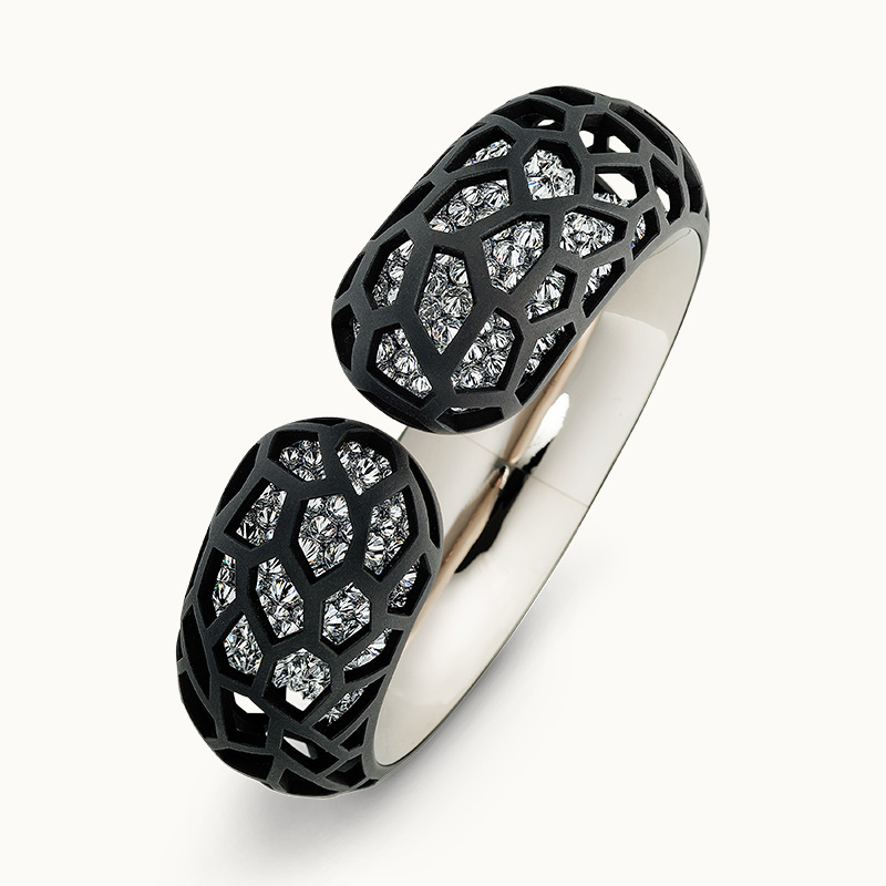
Harmony, 2017: diamonds, iron, silver and white gold. Private collection. Courtesy of Hemmerle.
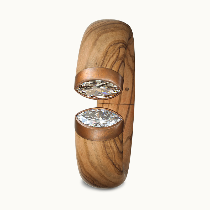
Harmony, 2012: diamonds, olive wood, copper and white gold. Private collection. Courtesy of Hemmerle.
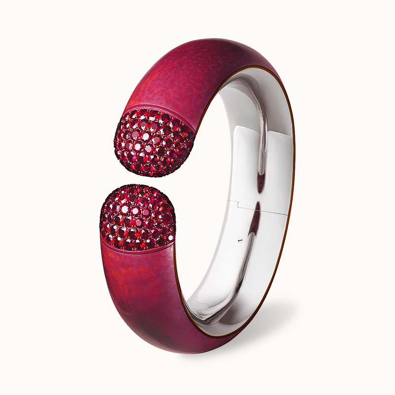
Harmony, 2009: spinels, copper and white gold. V&A permanent collection. Courtesy of Hemmerle.
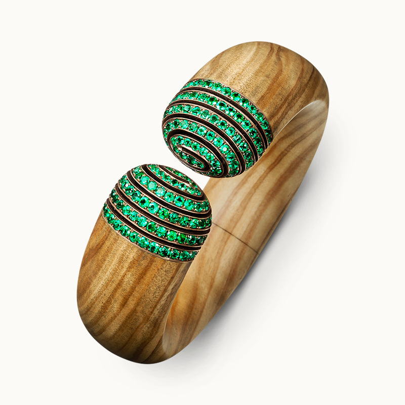
Harmony, 2019: emeralds, olive wood, bronze and white gold. Private collection. Courtesy of Hemmerle.
Begin with the dark lattice. In the 2017 example, openings in the iron reveal a bright surface beneath. The design holds the eye between two scales: the broad rounded ends and the small irregular spaces that articulate them. Darkness becomes part of the ornament.
The olive-wood bangle takes that contrast in another direction. Its grain travels along the curved body towards the diamond-set ends. The movement within the wood is as important to the image as the reflections in the stones. The surfaces remain distinct, with a slim metal interval marking their meeting.
Beside it, the red bangle gathers colour into an unusually coherent shape. Hemmerle identifies copper, spinels and white gold in this 2009 creation. Its ends appear dense and finely textured; its outer curve is smoother. The change in surface is legible even before you move close enough to consider individual stones.
Then emeralds meet olive wood. Several green bands wrap across the rounded ends while the grain continues around the larger curve. These four objects share an outline, but each asks you to look differently: through an opening, along a grain, across a field of colour or around a repeated band. The emerald bands are particularly revealing. Their horizontal rhythm crosses the lengthwise grain of the wood, bringing two directions together within a single curve. Compare that meeting with the lattice, where the small dark divisions scatter attention across the surface. The outline provides continuity, while the internal drawing changes the way your eye travels. That distinction helps explain why the same form can sustain such different identities.
A darker setting for brilliance

A Harmony bangle in a still life of contrasting surfaces. Courtesy of Hemmerle.
A dark bangle stands between pieces of split wood. The surroundings make the jewellery’s smooth curve especially clear: rough vertical edges stop abruptly beside a continuous rounded surface. It is a deliberate still life, bringing a polished object into conversation with a material that retains its broken edges.
Hemmerle traces its turn towards iron to a 1995 commission. An art-collecting client admired historic Berlin iron jewellery; Stefan Hemmerle responded by setting a diamond in textured iron. The combination became a starting point for a wider exploration of unconventional materials.
That history makes the dark surface worth a second look. Iron provides a strong visual boundary around a bright stone. It also gives the setting a presence of its own. You can enjoy the diamond’s light and the depth of the surrounding metal as two equally deliberate parts of the composition.
In a personal collection, this offers an appealing question: which surfaces make the stones you love most interesting to you? A familiar gem may acquire a different character beside a material you would never have thought to associate with jewellery.
The form stays; the palette changes
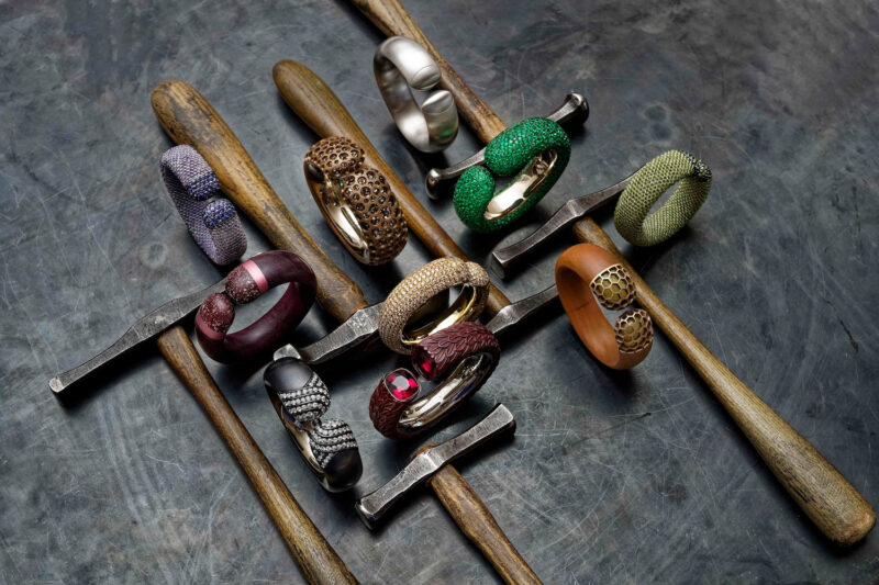
Harmony bangles seen together in the maison’s anniversary archive. Courtesy of Hemmerle.
Several bangles rest on dark supports, their coloured ends turned towards the camera. Some are compact, others seem broader; the arrangement allows their common rounded opening to emerge across many individual variations. The tools and unfinished-looking supports give the display a different energy from an isolated product portrait.
The Harmony bangle first appeared in 1991. Its curved form has remained a vehicle for material experiments, and Hemmerle describes a twisting clasp integrated into the design. That detail matters because a sculptural object must also find a practical relationship with the hand that puts it on.
Look at the inner contour as carefully as the visible ends. The opening, the thickness of the curved body and the transition to the terminal surfaces establish the whole silhouette. A compelling jewellery design has to resolve all of these relationships together.
Across the arrangement, colour seems to migrate from one object to another. Green, red and blue become individual accents within a shared language. It is a useful image of continuity: a house can keep asking the same formal question while allowing the answer to change with the materials.
Look at the meeting point
The surface
Move your attention away from the largest stone for a moment. Follow the metal, wood or patina around it. Notice whether the surface absorbs light, reflects it sharply or reveals a pattern within the material. That surrounding field shapes your first impression of the gem.
The interval
Find the small place where one material ends and another begins. A gold edge, a change of texture or a dark opening can organise the whole object. Hemmerle’s combinations become particularly rewarding when you give these quiet transitions the same attention as the stones.
A different idea of precious
Hemmerle’s own account of its philosophy gives materials little hierarchy. The photographs make that position tangible. Wood supplies a drawing that no setting needs to imitate; dark iron establishes a depth that polished gold would change; copper can carry colour across an entire curve.
The pleasure is in discovering what each material contributes. Return to the two diamonds in the opening image. Their brilliance remains, but so does the broad, dark form holding them. Both are necessary to the jewel you remember.
Sources & further reading
The Edit
Maisons & Heritage stories
Selected stories from the same editorial universe.
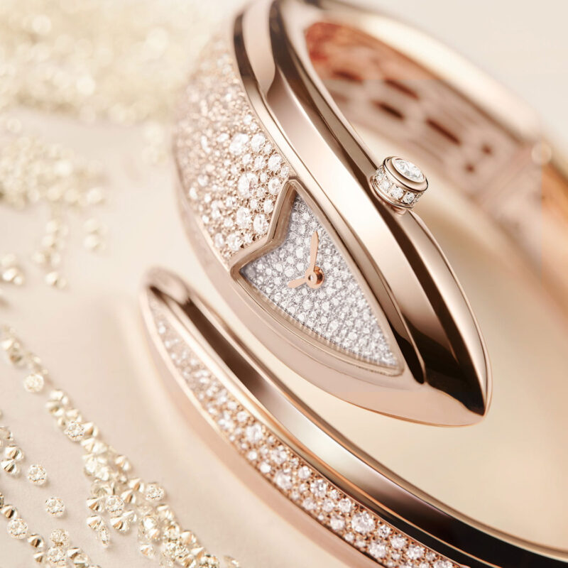
Bvlgari Serpenti Aeterna: The Snake Becomes a Line
A pointed head, an open coil and a fine seam of light. Serpenti Aeterna
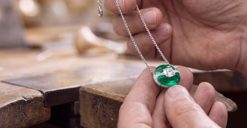
Boghossian: Where One Gemstone Meets Another
A diamond crossing an emerald changes both. A close look at Boghossian’s Kissing designs
Boucheron, Through Frédéric: Four Jewels, One Point of View
An architectural pendant, an open curve, diamonds over the shoulders and a branch of
12 Vendôme: Where Chaumet Keeps Memory and Making Together
At Chaumet’s 12 Place Vendôme, boutique, heritage salons and High Jewellery workshop share one
Tiffany Blue Book 2026: How Hidden Garden Rewrites Schlumberger
Hidden Garden treats Jean Schlumberger’s archive as a living design language, translating flora, birds,
Buccellati Tulle: Making Gold Behave Like Lace
At the bench, a sheet of gold becomes a network of tiny openings. Across