
TheTimeo / Maisons & Heritage
Boghossian:
one stone,
then another.
A diamond crossing an emerald changes both. A close look at Boghossian’s Kissing designs reveals a family maison’s interest in the space where gemstones meet.
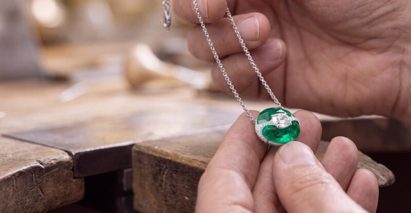
A pendant held at the workbench, from the maison’s broader craftsmanship imagery. Courtesy of Boghossian.
Explore the story
A long diamond crosses an emerald, leaving green visible on either side. The eye reads the two stones together, then begins to separate their shapes. That small act of looking is a useful way into Boghossian. In the maison’s Kissing designs, the meeting between gemstones becomes the subject of the jewel, with colour and placement carrying much of its character.
Colour becomes a setting
01 / 02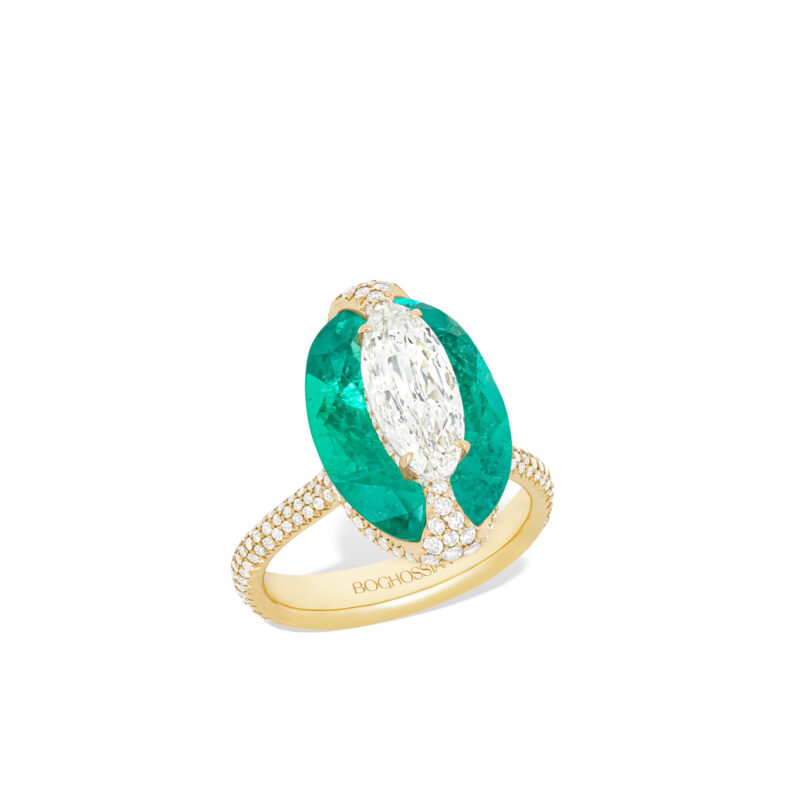
A diamond and emerald ring from Kissing’s Earth selection. Courtesy of Boghossian.
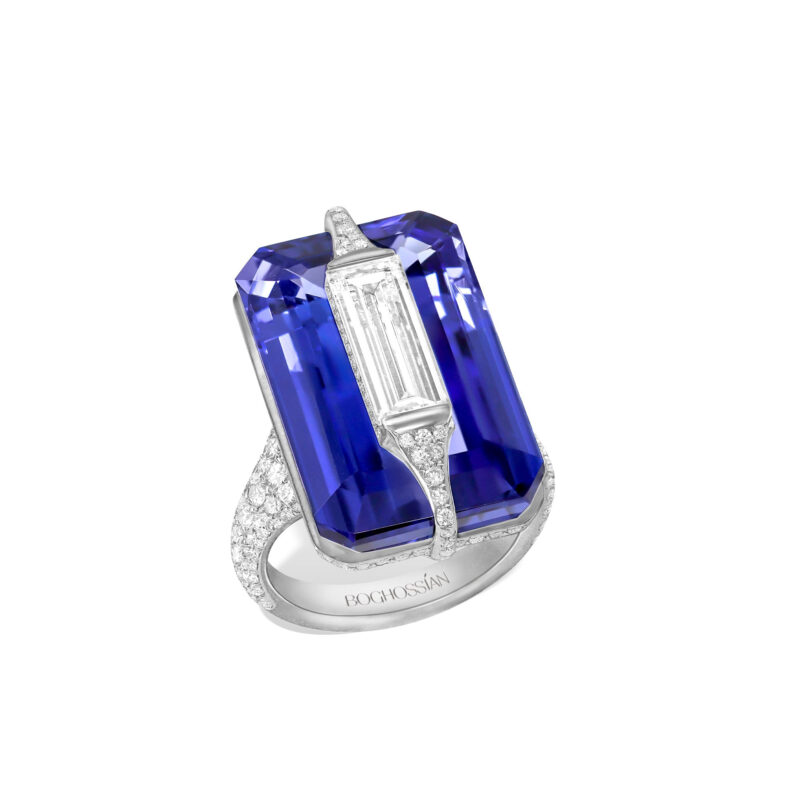
A diamond and tanzanite ring from the Water selection. Courtesy of Boghossian.
The emerald ring begins with an oval, but the diamond interrupts its outline. Rather than following the green stone around its perimeter, the pale central form passes across it. Two curved green areas remain visible. They make the diamond feel embedded in a field of colour, even though its brighter edge retains a separate identity.
The yellow-gold band brings warmth underneath that arrangement. In the official three-quarter photograph, its ribbed surface supplies another direction for the light to follow. The head has a broad, rounded shape while the shank narrows the composition towards the finger. It is a small piece of architecture whose upper surface is occupied almost entirely by the conversation between green and white.
Beside it, the tanzanite design replaces those curves with a more angular field. Blue-violet facets frame an elongated pale stone, making the relationship feel taller and more contained. The white metal beneath has less colour contrast than the yellow-gold band of the emerald ring. Here the changes of tone happen chiefly within the head, between the blue perimeter and the bright line crossing it.
Boghossian places these designs within the Earth and Water parts of its Kissing collection. Those names give the colours an imaginative setting, but the forms remain interesting before any theme is supplied. One spreads into an oval; the other concentrates into a more rectangular arrangement. The collection’s identity survives the difference because the stones continue to be understood in relation to one another.
The house describes Kissing as a way of setting gemstones together with little gold visible between them. In the photographs, that restraint allows the meeting of coloured and colourless surfaces to dominate. Small glimpses of the mount remain important: they reveal the jewel’s volume, lift it above the band and give the head a sense of depth.
A different kind of blue
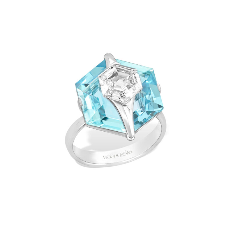
A diamond and aquamarine ring from the Air selection; a different composition from the tanzanite design. Courtesy of Boghossian.
The aquamarine ring changes the atmosphere. Its paler blue leaves more of the setting’s angular outline visible, and the bright diamond appears to cross a cooler, lighter field. Light and colour are closer here than in the tanzanite design. The contrast comes partly from the directions of the facets and the difference between the diamond’s shape and the outline behind it.
This is why the three rings are worth seeing at a generous scale. Reduced to a small catalogue tile, they could become a green ring and two blue ones. Larger, each proposes a different arrangement of areas, edges and height. The aquamarine design has a crisp outer contour, while the emerald offers a more rounded meeting and the tanzanite creates a darker frame.
Looking across those differences also changes the meaning of a signature. A recognisable idea need not produce an identical silhouette every time. Boghossian’s repeated gesture is the relationship between the stones. Their colour, cut and placement can alter the result considerably while leaving that central gesture legible.
The view from an angle matters as much as the outline from above. It reveals how the upper stone projects and where the coloured surface continues beneath it. That extra depth makes the meeting feel spatial. The appeal lies in the way one gem changes the reading of another, giving the eye several routes through a relatively compact object.
The meeting has to be made
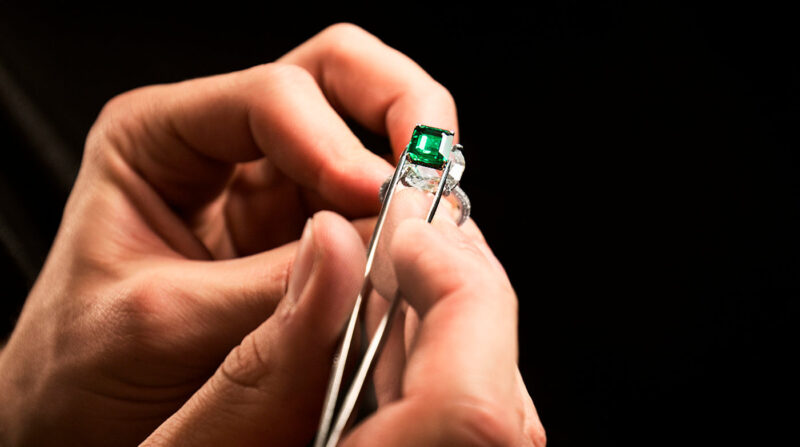
The Kissing technique illustrated in the maison’s official craftsmanship sequence. Courtesy of Boghossian.
In the maison’s Kissing craftsmanship image, hands and tweezers bring the stones back to a working scale. The green form is held close to a pale element, with fingers providing an immediate measure of their size. The darkness around the work draws attention towards the contact between them. The image makes a useful companion to the finished rings: a carefully arranged jewel begins as parts that must be brought into position.
Boghossian distinguishes Kissing from its Art of Inlay, where stones are carved and fitted into one another, and from Merveilles, another of the house’s named approaches to setting. The distinction is worth keeping. Different techniques can reduce the visual prominence of metal while creating quite different relationships between the gems.
In Kissing, the overlapping shapes remain individually readable. A diamond has its own edge and direction; the coloured stone retains its surrounding field. The impression of ease comes from how clearly those elements have been arranged. Seen together, the workbench image and the complete objects make that clarity feel purposeful rather than accidental.
A family point of view
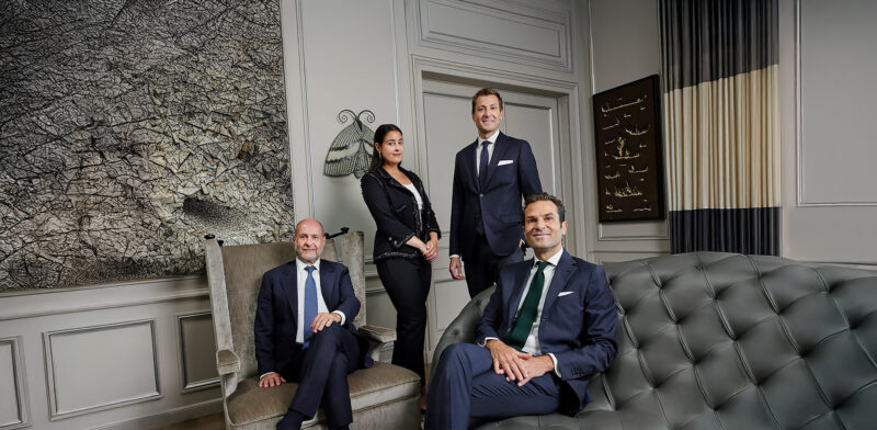
An official portrait of the Boghossian family, whose maison is based in Geneva. Courtesy of Boghossian.
The official family portrait changes the scale of the story once more. A group occupies a furnished room with artworks and a fireplace; the composition has the calm of an interior rather than the concentrated light of a jewellery photograph. It gives a human setting to a maison otherwise encountered through objects held close to the lens.
Boghossian’s own history describes a family of jewellers across six generations, now based in Geneva. That continuity is a useful context for its interest in gemstones. In the objects considered here, the practical design question is very immediate: what happens when the colour and shape of one stone are placed in direct relation to another?
The answer changes from ring to ring. A richer green, a darker violet-blue and a pale aquamarine each alter the role of the diamond. The same family of ideas can therefore feel warm, concentrated or cool without needing a large decorative surround. The stones supply the atmosphere as well as the focal point.
What stays with the eye
The point of contact
Begin where the stones meet. Follow the edge of the diamond, then the coloured surface around it. That route makes the differences between the rings clearer than a first impression of colour alone. It also encourages a slower reading of the jewel, in which a small change in outline can matter as much as the overall silhouette.
The whole object
Then step back to the band, the setting’s height and the outline of the head. Those elements give the meeting somewhere to belong. Boghossian’s Kissing designs are especially engaging when both scales remain in view: the intimate relationship between two gemstones and the complete ring that brings them to the hand.
Sources & further reading
The Edit
Maisons & Heritage stories
Selected stories from the same editorial universe.
Bvlgari Serpenti Aeterna: The Snake Becomes a Line
A pointed head, an open coil and a fine seam of light. Serpenti Aeterna
Boucheron, Through Frédéric: Four Jewels, One Point of View
An architectural pendant, an open curve, diamonds over the shoulders and a branch of
Hemmerle: Why a Diamond Can Belong in Iron
Dark iron, pale diamonds, wood and patinated copper. At Hemmerle, the character of a
12 Vendôme: Where Chaumet Keeps Memory and Making Together
At Chaumet’s 12 Place Vendôme, boutique, heritage salons and High Jewellery workshop share one
Tiffany Blue Book 2026: How Hidden Garden Rewrites Schlumberger
Hidden Garden treats Jean Schlumberger’s archive as a living design language, translating flora, birds,
Buccellati Tulle: Making Gold Behave Like Lace
At the bench, a sheet of gold becomes a network of tiny openings. Across