
TheTimeo / Jewelry
COLOURS OF
EXTRALEGANZA:
colour becomes structure
Piaget’s 2026 High Jewellery collection brings sapphires, opals, Paraíba tourmalines, ornamental stones and worked gold into the same design problem: colour as construction.
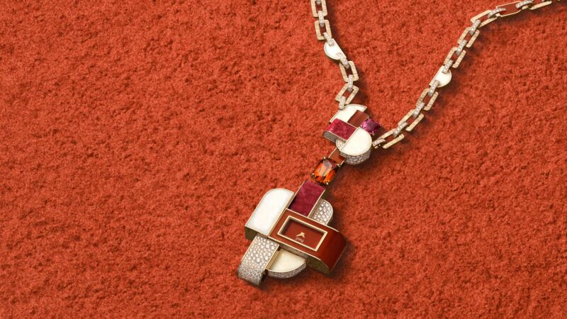
A sautoir watch crosses jewellery, colour and timekeeping in a single composition. Courtesy of Piaget.
Explore the story
Start with three stones.
One is an 8.52-carat cushion-cut sapphire from Madagascar. Another is a 3.30-carat Paraíba tourmaline. The third is a 13.98-carat black opal. In Piaget’s Blue Illusions necklace, they are not arranged as a conventional hierarchy with a single centre stone and everything else acting as support. Their colours have to work together.
That sounds obvious until you look at the problem the necklace sets itself. Sapphire gives a dense blue. Paraíba tourmaline pushes towards an electric blue-green. Black opal does not hold one colour at all. Its appearance changes as light crosses the stone. The surrounding sapphires, tourmalines and diamonds therefore have to connect three very different visual behaviours without flattening any of them.
Piaget says Colours of Extraleganza treats colour as a material. Blue Illusions is where that claim becomes testable.
The collection closes the three-part Extraleganza High Jewellery programme that began with Essence of Extraleganza in 2024 and continued with Shapes of Extraleganza in 2025. Press material distributed for the 2026 launch describes 65 creations, made in Piaget’s Ateliers de l’Extraordinaire. The current Piaget collection page groups the new work into families including Blue Illusions, Gems Pop, Flamboyant Links and Sunset Prism.
A list of stones, however, does not explain why these pieces look like Piaget.
The stronger connection runs through three older habits: using ornamental stones without treating them as lesser materials, giving gold a visible surface and texture rather than hiding it behind gemstones, and allowing a watch to behave like jewellery instead of insisting that the dial remain the centre of the object.
Colours of Extraleganza brings all three back into view.
Blue Illusions is built around relationships, not a single hero stone
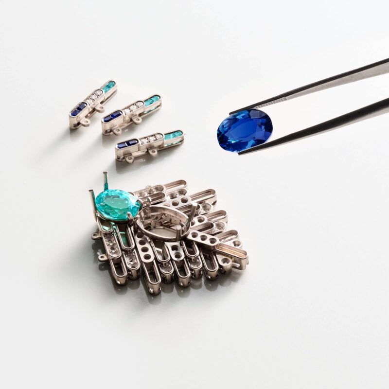
The setting sequence shows colour being resolved alongside structure. Courtesy of Piaget.
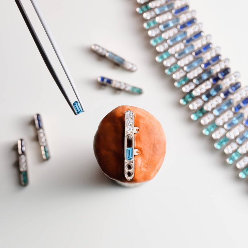
Custom-cut components change scale and orientation through the developing piece. Courtesy of Piaget.
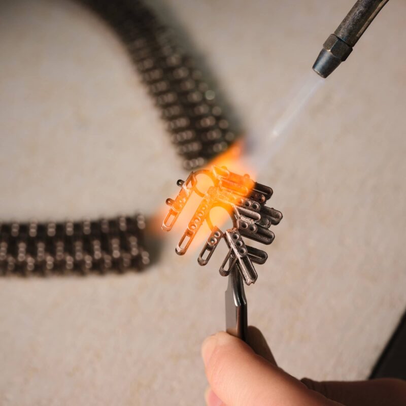
An atelier image records the physical work behind the necklace architecture. Courtesy of Piaget.
Blue Illusions took close to 900 hours to make, according to the launch material reproduced by specialist jewellery publications. The headline stones are the Madagascan sapphire, Paraíba tourmaline and black opal, but the more revealing detail is what happens around them.
Sapphires and baguette-cut tourmalines were custom cut during the making of the piece. Diamonds interrupt the colour sequence. The necklace uses repetition to move blue into green and back again around the neck.
That means the cutting cannot be treated as a separate stage that ends before design begins. If baguettes are being adjusted to the developing piece, the setting, proportions and colour transitions have to be resolved together.
This is why a carat-weight reading of the necklace is incomplete.
The 13.98-carat opal is numerically the largest of the three central stones. It does not therefore become the only visual centre. An opal carries colour differently from sapphire. It can flare and recede as the viewing angle changes. The Paraíba tourmaline has another kind of intensity, while the sapphire supplies a relatively stable field of blue. The necklace needs those differences.
Piaget’s current page describes Blue Illusions through blue sapphire, aquamarine, green tourmaline, black opal, Paraíba tourmaline and diamond. That list reads less like a conventional precious-stone ladder than a palette.
The important word here is not “colourful”. It is sequence.
A good photograph of Blue Illusions should show the whole necklace first, then move close enough to reveal how the baguettes change scale and orientation around the central stones. Without that second image, the reader sees colour but misses the work.
Piaget’s colour history begins with a movement problem
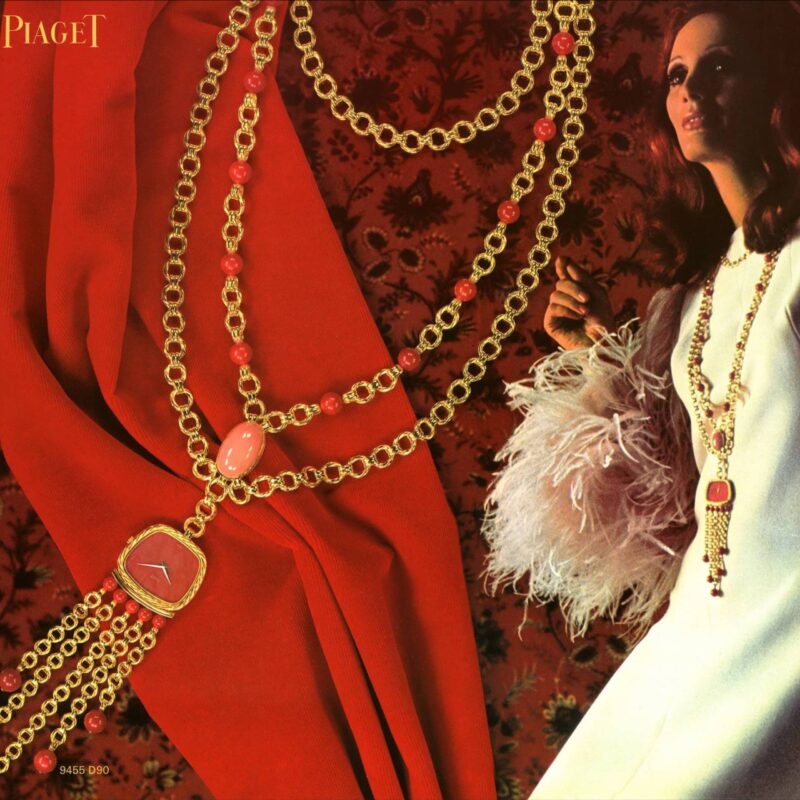
The 1969 jewellery-watch vocabulary established the sautoir as a place for time. Courtesy of Piaget.
It would be easy to connect the collection to the 1960s simply because the palette feels period. Piaget’s own archive gives a better route.
In 1957 the Maison introduced the manual-winding Calibre 9P, an ultra-thin movement that reduced the volume occupied by the mechanism. Piaget’s historical material links that technical development to a wider design field: thinner movements created more freedom around the dial, case and bracelet.
By 1963, Piaget records the arrival of watches using ornamental stones in their dials. Lapis lazuli, turquoise, opal, coral, tiger’s eye and other materials entered watchmaking not as small accents but as broad colour surfaces.
That shift matters for Colours of Extraleganza because it explains why Piaget can put an ornamental stone beside a conventionally precious gemstone without treating the arrangement as a provocation.
The Maison had already learned to read a dial as a slab of colour.
There is an inconsistency in Piaget’s current web copy worth recording. One “Vibrant Colours” page correctly places the experiment with ornamental-stone dials in the 1960s, but another sentence on the same page says “1996” for the first ornamental dial watches. Piaget’s history page and multiple other official heritage pages place the development in 1963. TheTimeo therefore uses 1963 and treats the 1996 line as unresolved website copy, not as a competing historical date.
Small inconsistencies like this are useful. They remind us that “official” does not remove the need to read sources critically.
Gold is not the frame around the colour
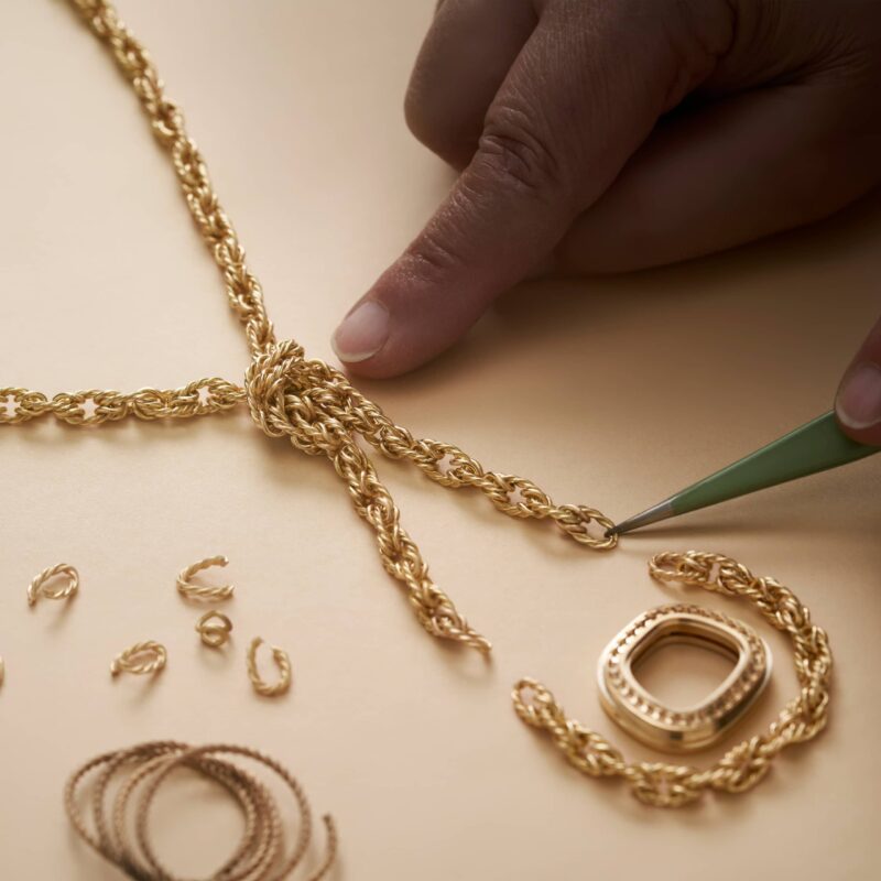
Gold is worked as an active surface and structural rhythm, not a neutral frame. Courtesy of Piaget.
Piaget’s 2026 collection also makes a second claim: gold belongs to the palette.
That has a clear technical history.
Piaget says its Decor Palace finish was developed in 1961. The technique cuts and textures the surface of gold so that the metal itself catches light in broken, irregular patterns. The point is not to make gold disappear under pavé. The point is to give gold enough surface character that it can compete visually with stones.
The Maison also records a 1957 decision to work only with precious metals for its watches, followed by an increasingly ambitious use of gold in jewellery watches. By 1969, the 21st Century Collection put heavily worked bracelets, openwork cuffs and long sautoirs at the centre of Piaget’s identity.
That history changes how we read a piece such as Flamboyant Links.
The gold is not neutral engineering carrying tiger’s eye and garnet. Its links create rhythm, mass and movement. The ornamental stone is not trying to imitate the brilliance of a faceted diamond. Tiger’s eye brings bands, opacity and a directional surface effect that only make sense if the gold beside it has its own texture and weight.
This is an old Piaget idea expressed with current proportions.
Flamboyant Links turns time into one component of the jewel
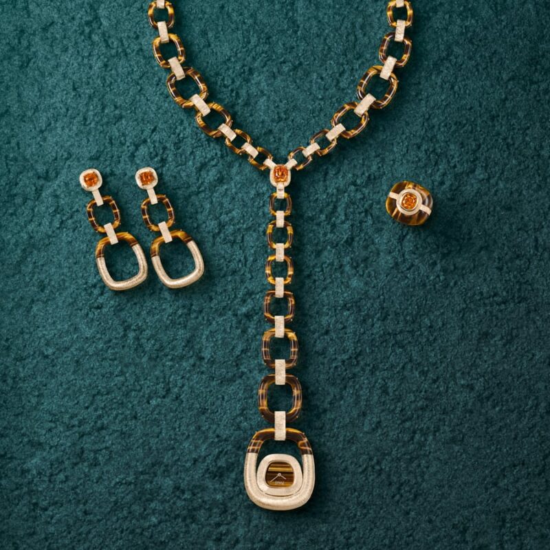
Flamboyant Links moves between sautoir, choker and wristwatch geometries. Courtesy of Piaget.
The strongest bridge back to 1969 is not a motif. It is a format.
Piaget’s 21st Century Collection was made entirely of cuff watches and sautoir watches. The watch did not have to be worn at the wrist, and it did not have to dominate the design. A movement could hang from a long gold chain, partly concealed by ornamental stones and jewellery construction.
Flamboyant Links brings that logic into 2026.
Specialist launch coverage describes the main piece as transformable between a long sautoir, a choker and a wristwatch. It combines engraved rose gold and tiger’s eye with a 4.13-carat mandarin garnet. Piaget’s current collection page confirms the Flamboyant Links palette as tiger’s eye and spessartite.
The transformation is more interesting than the list of materials.
When a pendant becomes a watch, the design has to solve at least three different states. It must hang with enough weight and balance to work as a sautoir. It must shorten without looking like a long necklace that has simply lost part of its chain. Then it has to move to the wrist, where the relationship between case, fastening, skin and reading angle changes again.
The same object therefore has several geometries.
That is why the 1969 reference is useful here. Piaget’s archive does more than provide a vintage image that resembles the new piece. It documents a period when the Maison was already treating the place of the watch on the body as an open question.
Gems Pop changes the rules again
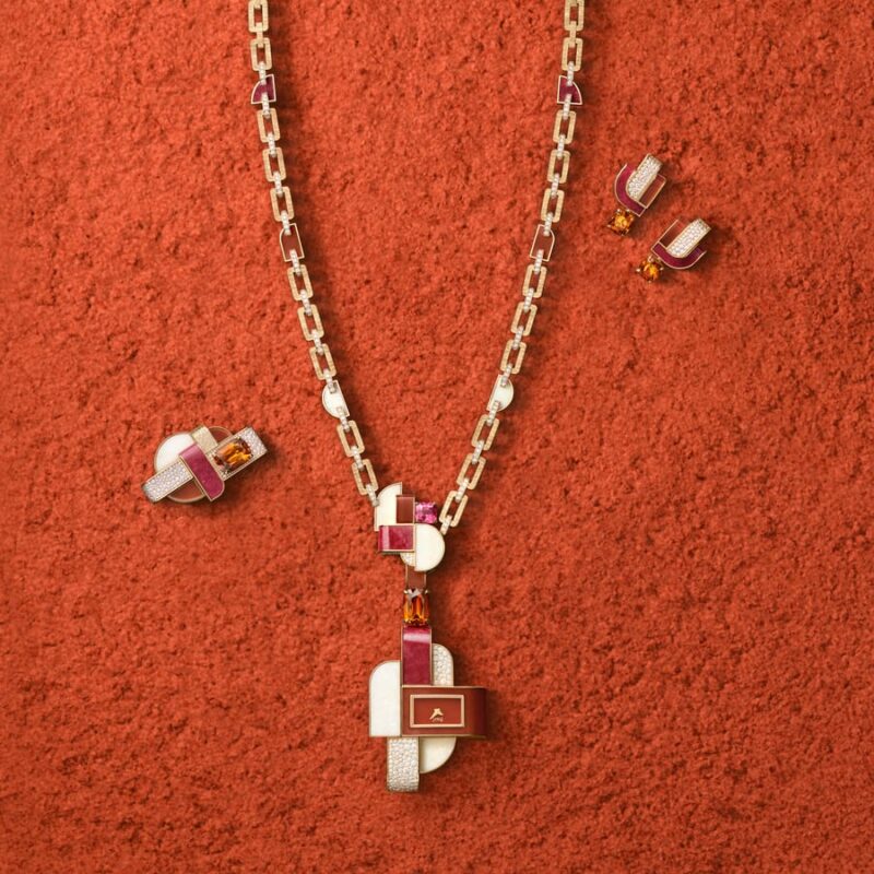
Gems Pop uses contrasting opacity, sparkle and saturation rather than a tonal sequence. Courtesy of Piaget.
Gems Pop is much less interested in tonal progression.
Piaget’s current collection page lists pink sapphire, spessartite, orange aventurine, thulite, white opal and diamond. Specialist coverage of the launch identifies an influence from the Memphis design movement, with strong geometry and deliberate colour clashes.
The ring makes the idea easy to read. It centres on an 8.53-carat mandarin garnet, according to specialist reporting, and surrounds that orange with sections of white opal, pink thulite and orange aventurine.
None of those materials behaves the same way.
Opal can be milky and internally active. Thulite has a dense, relatively even pink. Aventurine brings granular sparkle. A faceted garnet concentrates colour and light into a much smaller volume.
The ring therefore gets its effect from differences in surface as much as differences in hue.
This is where the phrase “colour as material” earns its place. If all the sections were replaced by identically polished enamel, the palette might survive but the object would not. The separate materials give each colour a different depth, opacity and response to light.
The Gems Pop sautoir pushes that idea into a timepiece again. Launch coverage describes a detachable watch pendant and identifies Decor Palace links in the construction. The watch can be removed from the long necklace, which puts the collection’s jewellery-watch lineage back into practical use rather than leaving it as a heritage reference.
Sunset Prism is a warmer, simpler test
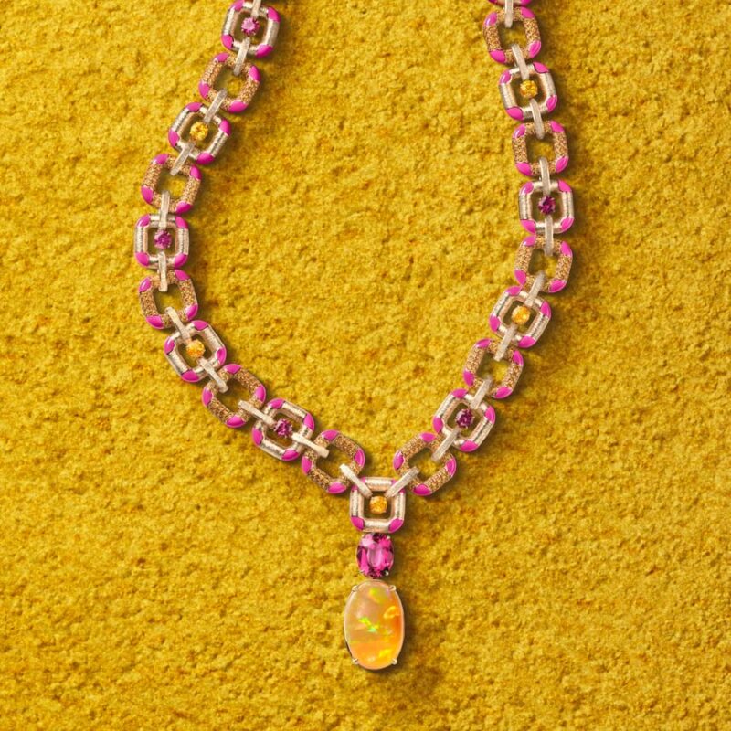
Fire opal, rubellite and spessartite create a warm transition through different optical behaviours. Courtesy of Piaget.
Not every set needs the complexity of Blue Illusions.
Piaget’s current site identifies Sunset Prism through fire opal, rubellite and spessartite. That is a compact palette, but the stones still do different jobs.
Fire opal can carry a nearly transparent orange or a more opaque body colour. Rubellite moves into saturated red and pink. Spessartite supplies a strong orange that can sit between them. Gold then adds another warm surface.
The arrangement is useful because it shows the difference between adding colours and building a transition.
A palette of red, pink, orange and gold could easily collapse into one temperature. The designer has to control which areas are transparent, which are reflective and which are dense enough to anchor the composition.
The materials are close chromatically but far apart optically.
That is a recurring method across Colours of Extraleganza. The collection is not simply combining unusual colours. It is combining different ways of producing colour.
Gold Swirl shows how watchmaking surface codes can migrate
Gold Swirl appears more prominently in specialist launch coverage than on Piaget’s current public collection page.
Reports on the 2026 presentation describe curved gold volumes crossed by diamonds and blue-green tourmalines, with fluted or gadroon-like surfaces moving from Piaget’s watch vocabulary into High Jewellery. Some coverage describes this as the first use of rose-gold fluting of this kind in a High Jewellery set.
That “first” requires stronger primary documentation before TheTimeo would publish it as a definitive historical claim.
The migration itself is easier to support.
Piaget has spent decades using repeated grooves, engraving, textured bracelet surfaces and shaped gold around watches. The current House of Gold material documents how gold decoration remains a named craft inside the Maison. Gold Swirl can therefore be read as part of a larger exchange between watch case, bracelet and jewel.
This is another reason the collection resists a jewellery-only reading.
Piaget’s two disciplines keep borrowing each other’s tools.
The 65 pieces do not form one visual system
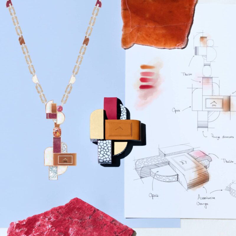
A design study establishes proportion before stones and metal settle the final object. Courtesy of Piaget.
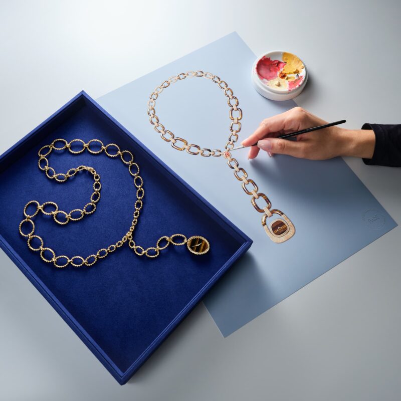
The drawing table connects the collection’s colour thesis to decisions of scale and sequence. Courtesy of Piaget.
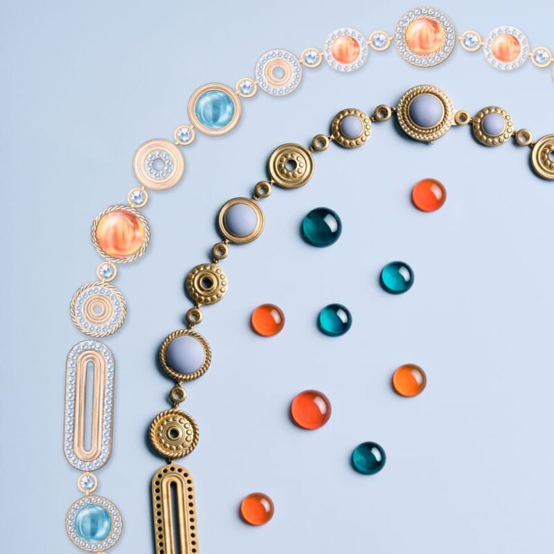
Different materials give each colour its own depth, opacity and response to light. Courtesy of Piaget.
A large High Jewellery collection can become difficult to read because the launch narrative encourages us to treat every object as evidence of the same thesis.
Colours of Extraleganza is more useful if the opposite approach is taken.
Blue Illusions is controlled by transition and optical movement.
Flamboyant Links is controlled by transformation and the relationship between gold, ornamental stone and the body.
Gems Pop uses collision. Its materials are meant to remain visibly different.
Sunset Prism narrows the palette and works within a warmer family.
The jewellery watches bring another variable: timekeeping must be present without forcing the piece back into the format of a conventional wristwatch.
Those are different design problems.
Calling them all “colour” is accurate but not sufficient.
The 1960s and 1970s reference is strongest where it is specific
Piaget repeatedly cites the creative energy of the 1960s and 1970s when discussing Extraleganza. The connection is persuasive when it can be attached to objects and techniques.
The Maison introduced Decor Palace in 1961.
Its historical materials place ornamental-stone dials in 1963.
The creative studio established under Valentin Piaget later brought jewellery-trained designers into watchmaking.
In 1969 the 21st Century Collection made cuffs and sautoirs central formats.
Those facts explain a great deal about the 2026 collection without requiring vague nostalgia.
They also explain why a Piaget High Jewellery story can move from a gem-setting bench to an ultra-thin calibre without changing subject. The watchmaking and jewellery histories are already entangled.
What would be less convincing is to claim that every bright stone or curved line in 2026 comes directly from a specific archival piece. The collection does not need that level of ancestry.
Heritage is most useful when it clarifies a design decision, not when it is used as a blanket certificate of authenticity.
The stones do not all carry the same kind of evidence
For collectors, coloured-stone language deserves care.
Piaget identifies a Madagascan sapphire in Blue Illusions and names a Paraíba tourmaline. Those are material claims with different implications. “Madagascan” is an origin statement. “Paraíba” identifies a copper-bearing tourmaline category whose use in gemmology does not, by itself, establish Brazilian origin.
TheTimeo is therefore not adding a geographic origin to the Paraíba tourmaline unless a laboratory report or Piaget documentation states it.
The same caution applies to opal.
Some specialist coverage describes the Blue Illusions stone as Australian. Other launch summaries refer only to a black opal. Piaget’s current public collection page lists black opal but does not expose the full origin documentation. Until a Piaget master fact sheet or gem report is obtained, the article does not present Australia as established.
This level of restraint may seem small in a collection dominated by colour.
It is exactly where a serious jewellery publication should be careful.
What the workshop images add
Piaget’s current Colours of Extraleganza page is unusually useful because it does not show only finished pieces.
There are design sketches, stone layouts, assembly stages and an image of a metal frame being heated during construction. Other images show individual stones positioned before the finished jewel exists.
Those photographs change the article.
A finished necklace makes colour look immediate. A bench image shows how much sequencing occurs before the result feels natural. Stones have to be sorted, cut, oriented and physically held. A colour transition that looks spontaneous on the body may have required repeated adjustments at the bench.
For TheTimeo, those process photographs should not be decorative breaks. They should sit beside the passages that explain why colour depends on structure.
If Piaget grants editorial masters, this article should use at least 10 to 14 images, including multiple making-of frames. A single hero and three product shots would undersell the subject.
The collection’s best idea is not exuberance
Piaget uses “Extraleganza” to describe a house style built around extravagance and elegance. That is the Maison’s language.
The more useful editorial observation is simpler.
Colours of Extraleganza refuses to let value hierarchy dictate visual hierarchy.
A black opal can matter because it connects blue and green. Tiger’s eye can occupy as much visual space as a faceted gemstone. Gold can be worked until its surface becomes part of the palette. A watch can disappear into a sautoir and later become a wristwatch. An ultra-thin movement developed in the 1950s can still matter because of the design space it helped create.
None of this makes rarity irrelevant. High Jewellery still depends on difficult stones, skilled setting and large amounts of labour.
But the 2026 collection is strongest when the rarest object in the room is not automatically asked to do all the talking.
Piaget has made colour do the organising.
The stones, gold and watchmaking follow from there.
Key facts
- Collection: Piaget Colours of Extraleganza, 2026.
- Position in series: final chapter of the Extraleganza High Jewellery trilogy after Essence of Extraleganza (2024) and Shapes of Extraleganza (2025), according to 2026 launch material.
- Scale: 65 creations, according to distributed press material and multiple specialist reports reproducing Piaget’s release.
- Current Piaget families shown online: Blue Illusions, Gems Pop, Flamboyant Links and Sunset Prism.
- Blue Illusions centre stones: 8.52-carat cushion-cut Madagascan sapphire, 3.30-carat Paraíba tourmaline and 13.98-carat black opal, according to launch documentation reproduced by specialist sources.
- Blue Illusions making time: close to 900 hours, according to the same launch material.
- Flamboyant Links: tiger’s eye and spessartite on Piaget’s current page; specialist launch coverage describes a transformable sautoir/choker/wristwatch centred on a 4.13-carat mandarin garnet.
- Gems Pop: pink sapphire, spessartite, orange aventurine, thulite, white opal and diamond on Piaget’s current page.
- Sunset Prism: fire opal, rubellite and spessartite on Piaget’s current page.
- Historical anchors: Calibre 9P in 1957; Decor Palace in 1961; ornamental-stone dials documented by Piaget from 1963; 21st Century Collection in 1969.
- Unresolved: the exact geographic origin of the Blue Illusions black opal is not treated as established from Piaget’s current public page; Paraíba is not treated as a Brazilian-origin claim without specific lab/origin documentation.
Sources & further reading
This article prioritises Piaget’s current Colours of Extraleganza page, Piaget’s history, House of Gold, Vibrant Colours and Swinging Sautoirs heritage pages, plus the Piaget pressroom as the preferred media route. Detailed carat weights and workshop-hour figures come from launch material reproduced consistently by specialist jewellery publications. Where Piaget’s current website and secondary launch coverage differ in specificity, the article keeps the narrower claim unless stronger primary documentation is available.
Last verified: 5 September 2026.
The Edit
Jewelry stories
Selected stories from the same editorial universe.
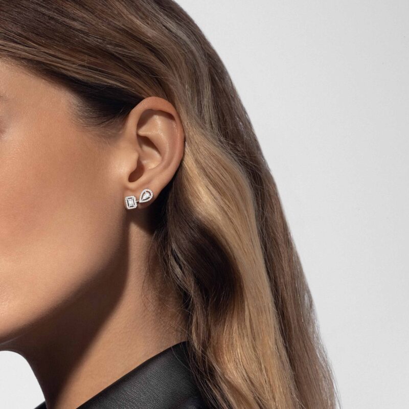
Messika My Twin: Two Cuts, One Bridal Look
An emerald cut, a pear and an unequal pair: the small asymmetry of Messika

Two Rings, Two People: A De Beers Wedding-Band Edit
A rose-gold court profile, a single diamond in platinum, a fine eternity line or
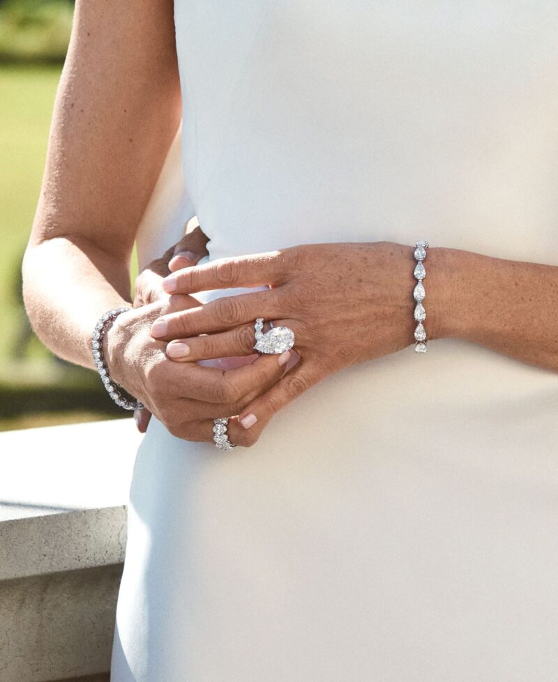
Norman Silverman Bridal: A Ring with Presence
A pear solitaire on the hand, a radiant seen in profile and an emerald-cut
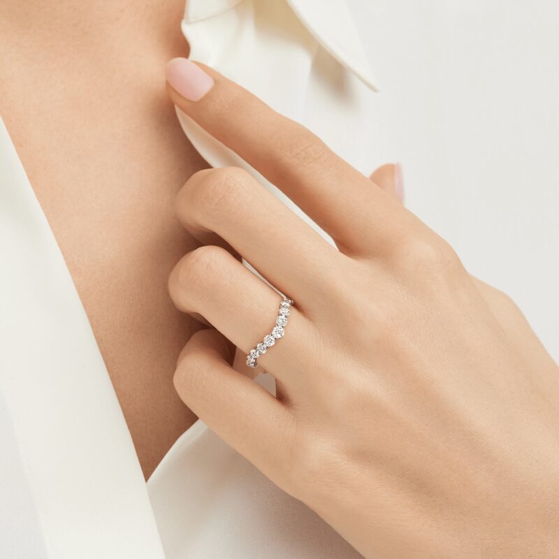
Harry Winston Beyond the Ring: Choosing the Wedding-Day Jewels
The engagement ring does not have to carry the whole wedding look. Harry Winston’s
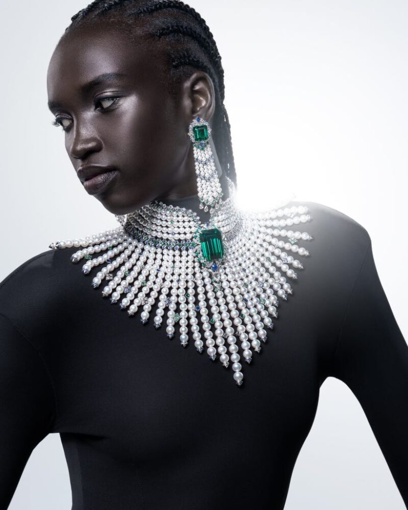
L’éclat Solaire: Mikimoto Turns Pearl Light into Colour
A pearl collar, a commanding green centre and a fan of descending strands give
Why Leave a Diamond Rough? What De Beers Talisman Still Preserves After Twenty Years
A rough diamond arrives with its own geometry. Twenty years after Talisman, De Beers